Maltese brewer Cisk modernized its brand design to appeal to younger audiences and international markets while maintaining heritage elements like its iconic stallion imagery and Maltese cross patterns. The redesign strengthens the brand's relevance for both loyal customers and new generations.
- Cisk, owned by Simonds Farsons Cisk, has over 90 years of brewing experience in Malta
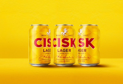
- The redesign frees the stallion imagery from its shield and redraws the Cisk marquee with modern angles and simplified typography
- The new design maintains the red and yellow color scheme and introduces a faceted pattern based on the Maltese cross
- The brand collaborated with London consultancy bluemarlin starting in December 2021, building on 2019 positioning strategy
- Full rollout across all products targets completion by summer 2024
Long-running Maltese brewer Cisk is serving up a modernized look to solidify its popularity at home and support its growth into new audiences.
With over 90 years of brewing experience in the rear-view, the Simonds Farsons Cisk-owned brand rejuvenated its image for modern and emerging consumer groups, according to a release from London brand design consultancy and redesign developer bluemarlin.
“The modernized Cisk brand identity comprises many elements, working together to create something greater,” Susan Weenink Camilleri, head of sales and marketing at Simonds Farsons Cisk, says. “The upgraded iconic assets will work beautifully in any environment – events, points of sale, communication touchpoints, still and animated campaigns.” Cisk's new package design aims to appeal to modern consumer groups.bluemarlin
Cisk began collaboration with bluemarlin for this project in December 2021, building from a brand positioning strategy the two had first developed in 2019, the consultancy says. It aimed to strengthen and futureproof the brand’s relevance in Malta by appealing to both loyal drinkers and upcoming generations, as well as internationally through the tourism market and Maltese expatriates.
“The new design system gives Simonds Farsons Cisk a robust and flexible structure that will continue to build brand equity now and in the future,” says Andrew Eyles, bluemarlin founder and CEO. “It remains part of Maltese heritage, but with an eye firmly on the horizon.”
Reinforcing Heritage as a Modern Maltese Brewer
The brand’s stallion imagery remains above the Cisk marquee but is now freed from the confines of a shield and has been redrawn and inverted. The hierarchy reenforces the stallion icon as a representation of the brand and “punctuates our essential claim of ‘Malta’s Finest,’” which surrounds the icon on the package, bluemarlin says.
 The new logo features a simplified font and a redesigned stallion icon.bluemarlin
The new marquee features a few subtle nods to the brand’s heritage as well, with the ‘C’ crafted into a horseshoe and the ‘K’ resembling the now-inverted rearing stallion.
The redesign features the same red and yellow color scheme as before but drops the ornate imagery of the old design. Covering the new background is a faceted pattern based on the Maltese cross.
“It was clear we needed to harness the loud and proud spirit of the Mediterranean,” says Guy Robertson, bluemarlin lead brand designer for this project. “We wanted to add a sense of unconstrained spontaneity, so we designed a progressive fresh brand livery that speaks of Malta today.”
The brand reserved the new design treatment to its flagship lager and low-carbohydrate Excel products, but the design was developed to work across all SKUs and future rollouts. The brand’s full range should be updated with the new identity by summer 2024, bluemarlin says.