It seems Irish eyes have long been smiling—managers of Diageo plc’s Baileys Irish Cream have had an enviable franchise for the following reasons:
1. Globally, Baileys has been the most successful new spirits entry in the last 30 years.
2. The brand has had double-digit growth in the United States the past three years.
3. Baileys is the No. 1 cordial in the world, supplanting Westport, CT-based Allied Domecq Spirits USA’s Kahlúa in January 2004.
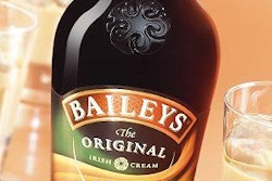
Yet, it was decided that the current design, the fifth redesign since the launch of the brand in 1974, was much needed.
For one thing, a number of products had since entered the Irish cream category with designs that tended to mimic Baileys packaging. Thus, by default, Baileys had became another “me too” in the category.
“It needed to be contemporary, engaging, and stand out on the shelf,” explained Diageo brand director Barry Sheridan, speaking at the Market Research for Package Design conference. Sponsored by the Institute for International Research, the conference was held last fall. “However, we needed to maintain the brand’s authenticity, heritage, and quality.”
Months of internal and consumer testing conducted on three continents revealed “significant” design-related issues, centering on the fact that the brand was perceived as old-fashioned.
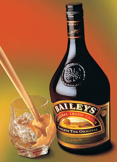
Diageo felt that the original bottle shape, which was portly, was viewed as stodgy, and that the label appeared cluttered and “fussy.”
Landor Associates was chosen to develop the new design.
Key changes in design were the following:
• A slender, more curvaceous bottle design topped by a new cap design that carries the familiar R.A. Bailey signature of authenticity.
• A more contemporary embossed bottle seal adorns the bottle.
• The eye-catching logo has been given more prominence and the Celtic weave background pay’s homage to the brand’s Irish roots.
• New “flowing silk” motifs replace the traditional landscape scene to offer a contemporary expression of the brand’s heritage and capture the warm sensuality of the product.
Diageo unveiled the stylish, contemporary new look in spring 2004 in the United Kingdom, and rollout continues globally. Bailey’s managers did not consider a test market because of the thoroughness of their prelaunch testing.
Some elements remained untouchable, such as the eyebrow logo, the words “original Irish cream,” and the R.A. Bailey signature.
Sheridan said that of all the elements that were changed, the toughest to let go of was the landscape imagery. Unfortunately, with the debut of other Irish creams on store shelves, that imagery had become clichéd, he says. “Others came in and made our current design generic to the category,” said Sheridan.
“We married key rational and emotional elements better in the new design,” said Gabriel Sciallis, Diageo’s consumer planning and research manager. “The new design is seen as more sophisticated, passionate, and mysterious.”
The new look is used on 10 sizes globally from 50 mL to 1.75 L, of which six sizes are sold in the United States. With the exception of the 50-mL size, which is PET, all are glass.
Diageo has high expectations for the brand: Sales that stand at 74 million bottles are expected to soar to 120 million bottles by 2007. Much of that will be attributable to current users increasing their frequency of enjoying Baileys rather than new users. Those numbers should keep managers’ Irish eyes smiling.