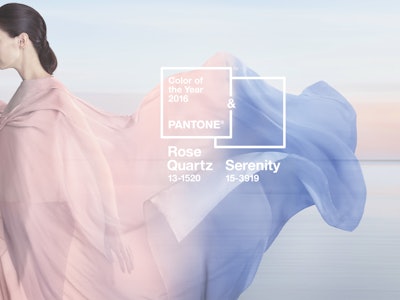
Pantone LLC, an X-Rite company, has announced PANTONE 15-3919 Serenity and PANTONE 13-1520 Rose Quartz, which it describes as “a harmonious pairing of inviting shades that embody a mindset of tranquility and inner peace,” as the PANTONE Color of the Year selection for 2016.
Pantone explains that as consumers seek mindfulness and well-being as an antidote to the stress of modern day lives, welcoming colors that psychologically fulfill the yearning for reassurance and security are becoming more prominent. Weightless and airy, like the expanse of the blue sky above us, Serenity comforts with a calming effect, bringing feelings of respite and relaxation even in turbulent times. Rose Quartz is a persuasive yet gentle tone that conveys compassion and a sense of composure.
“With the whole greater than its individual parts, joined together Serenity and Rose Quartz demonstrate an inherent balance between a warmer, embracing rose tone and the cooler, tranquil blue, reflecting connection and wellness as well as a soothing sense of order and peace,” says Leatrice Eiseman, Executive Director of the Pantone Color Institute.
The prevalent combination of Serenity and Rose Quartz also challenges some more traditional perceptions around color association, Pantone notes.
“In many parts of the world, we are experiencing a gender blur as it relates to fashion, which has in turn impacted color trends throughout all other areas of design,” Eiseman adds. “The more unilateral approach to color is coinciding with societal movements toward gender equality and fluidity, the consumers’ increased comfort with using color as a form of expression, which includes a generation that has less concern about being typecast or judged, and an open exchange of digital information that has opened our eyes to different approaches to color usage.”
About the PANTONE Color of the Year
The Color of the Year selection process requires thoughtful consideration and trend analysis. To arrive at the selection each year, Pantone’s color experts at the Pantone Color Institute comb the world looking for new color influences. This can include the entertainment industry and films in production, traveling art collections and new artists, fashion, all areas of design, and popular travel destinations, as well as new lifestyles, playstyles, and socio-economic conditions. Influences may also stem from new technologies, materials, textures, and effects that impact color, relevant social media platforms, and even upcoming sporting events that capture worldwide attention.
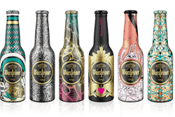
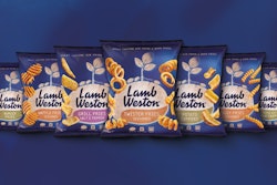
For 16 years, Pantone’s Color of the Year has influenced product development and purchasing decisions in multiple industries, including fashion, home furnishings, and industrial design, as well as product packaging and graphic design.