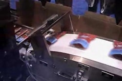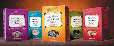
So the company assigned Compass Design (Minneapolis, MN) the task of giving the packs a new attitude. Compass’ design goal was to create a down-to-earth, folksy package with a dash of exuberance. The cartons are decorated with a logo that ties into the “dancer” part of the Kitchen Dancer name, flowing easily into other, more text-driven graphic components. The logo plays off a musical theme, incorporating a hand-illustrated soup ladle in the shape of a note on a gently curving musical staff. The theme continues onto the back of the package where the logo is repeated, followed by a four-paragraph story about the company, cooking instructions, and nutrition information. The front label looks like hand-torn paper, differentiating each of the five soup flavors from one another. “Compass did a great job on the package design,” says Kitchen Dancer co-founder Maggie Mortsenson. “They really captured the essence of our company and our brand.” Kitchen Dancer Soup Mix is available at grocery and specialty food stores nationwide. —ALR