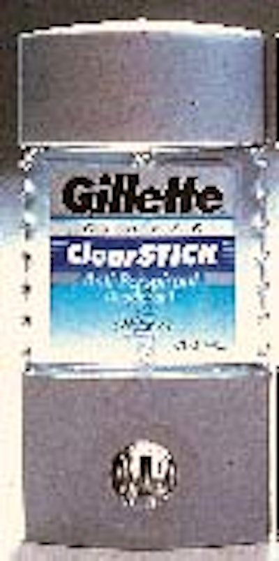
Just as intriguing are the package's labels. Gillette wanted the label graphics to echo the metallic look of previous products in the series yet still showcase the clear look of this new product. The solution required a challenging combination of print processes and tight registration with zero trapping to reach the desired balance of color, metallics and clarity. "It's quite an achievement," comments Gillette's Pamela Parisi, senior manager, design. The front label is intended to look partially "metallic" thanks to a rotary screen-printed matte silver background and touches of hot stamped foil. A three-tone blue gradient, rotary letterpress printed, starts opaque and becomes transparent, showcasing the clear product. The metallic/clear dichotomy is further enforced by the rear label, similarly rotary screen and letterpress-printed on a metallized substrate that can be seen when viewed through the partially transparent front label. Both labels are printed by DowIndustries (Wilmington, MA).