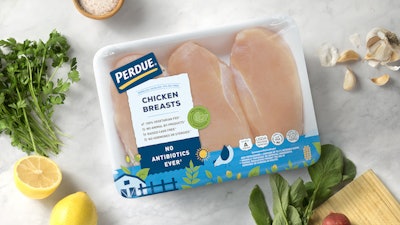
In September 2018, shoppers familiar with—and new to—Perdue Farms’ poultry were introduced to new-look packaging for fresh, tender chicken that plays to a younger demographic audience and points to the company’s strong social stands and belief in responsible food and agriculture.
Even the company’s website entices visitors to “try out the new look for yourself” by uploading a “selfie” image, adding “stickers and frames,” and posting an image that’s anchored at the bottom by the new package graphics and “Fresh New Look, Same Tender Chicken” tagline.
Salisbury, MD-based Perdue explains, “To enhance credibility and preference amongst today’s evolving consumer, Perdue is introducing a new, modern package design for its line of fresh chicken. The contemporary design introduces a variety of playful illustrations and vibrant colors aimed to inspire and connect with the millennial demographic, while staying true to the Perdue way. The redesign also highlights trusted product attributes like no antibiotics ever, 100-percent vegetarian fed, no animal by-products, raised cage free and with no hormones or steroids.” The company notes that hormones or steroids in poultry are prohibited by federal regulations.
According to Perdue, this rebrand represents the fourth major packaging update in the history of the brand, further highlighting key brand messages and attributes with shoppers. “Resonating extremely well with consumers, more than 65 percent of overall participants surveyed in a brand consumer test favored the new design and Millennials preferred the updated look 200 percent more,” the company says.
Design firm details
The new look was developed by Perdue in coordination with Oakland-based design agency Enlisted Design. It involved creating what the design firm describes as “an entirely new visual language that celebrates the brand’s best practices, including chickens raised in America on family farms, all-natural, no animal by-products, and no antibiotics ever. “The bold, uncluttered typography and clear benefits help consumers easily identify Perdue products on shelf,” says Enlisted. “And we evolved the brand’s iconic blue to brighter, fresh, more modern hues. The new design radiates a sunshiny-fresh vibe—repositioning Perdue as more modern, approachable and natural.”
Enlisted’s Beau Oyler, Principal and Creative Director, explains, “To widen their appeal to younger generations—a demographic potentially unfamiliar with the legacy brand—Perdue [packaging] needed to feel more modern, approachable, and natural. The brand refresh needed to more clearly communicate Perdue’s natural food offerings and humane farming practices. Our design also needed to [be] authentic to the brand’s existing engaged and loyal customers. We designed a new brand identity that captures Perdue’s bright and future-forward vision with modern farm illustrations, vibrant color, and bold-meets-minimalist typography.”
These design elements aim to help solidify Perdue’s position as one of the country’s leading poultry companies. The iconic American brand’s packaging was given storybook-style illustrations, with Enlisted creating a signature farm scene that captures the brand’s bright, optimistic, future-forward vision. “Hand-drawn details combine with wood-grain textures to bring the rustic pasture to life—from farmhouses, fences, sunshine, and marigolds to ingredients in the chickens’ natural diet [herbs, corn, and soybeans],” says Oyler.
Packaging specifics and material suppliers were not revealed. But Oyler did provide insight on another important goal of the redesign: “Perdue is uniquely capable of bringing natural and organic products to consumers at an affordable price point. This remarkable offering was not reflected in their existing brand design. The new design repositions Perdue as a brand that is relevant and affordable to a rising generation of consumers who are looking for alternatives to factory farming.
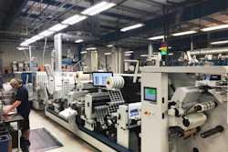
“One of our biggest design challenges was consistently communicating the messaging hierarchy across all product packaging. It delivers a strong, cohesive, and scalable design system able to accommodate all printing methods. There are multiple printers depending on the type of product, but a majority of Perdue’s packaging is printed on rollstock on 10 color stations. Exceptions do apply. Tray sizes vary and therefore the graphics and placard proportions adjust accordingly.”
Enlisted describes packaging as a primarily manual process, with a placard added prior to vacuum sealing of film over a tray. A weight price label is applied to the packaged product prior to shipping to grocers in most instances, although in some scenarios, weight price labels are applied at the grocery store.
The redesign involves 50 SKUs of fresh raw products, including chicken legs, chicken wings, chicken breasts, chicken thighs, chicken drumsticks, gizzard, liver, patties and ground chicken, all of which are sold in refrigerated cases. Geographically, products are sold in the Midwest and East Coast via outlets such as Safeway at what are described as entry-level price ranges.
Initial Perdue research shows the rebrand is a win with Millennials and existing customers alike. According to the company’s Consumer Preference Share research, 65% of the younger consumers and 30% of Perdue loyalists prefer the redesign.
Says Oyler, “Perdue does anticipate increased sales from the changes. The brand redesign now effectively evokes the brand’s wholesome, trusted ‘We Feed Happiness’ philosophy—and can be used across all marketing and advertising. This more effective communication of Perdue’s values will help the iconic brand retain loyal customers while also acquire younger generations that are continuing to grow their own families.”
Jim Perdue, Chairman and brand spokesman, notes, “Fifty years ago, my dad put our family name on chicken. It was more than a label, it was his personal promise of quality. Over the years, our look has changed and so have we. Perdue is continually improving everything we do, and that’s why we’re introducing new packaging for our fresh chicken.”