With greater numbers of consumers seeking healthy beverage options, Nestlé Waters North America is using packaging to drive growth in the sparkling water category—a category that Euromonitor says grew 70% from 2011 to -2016 and will reach $3.1 billion by 2022.
To strengthen its position in the rising sparkling water category, Stamford, CT-based Nestlé Waters North America in February 2018 introduced a new sparkling portfolio for its six regional spring water brands—Poland Spring, Deer Park, Zephyrhills, Ozarka, Ice Mountain, and Arrowhead. They will join the company’s sparkling water brands Perrier and S.Pellegrino.
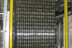
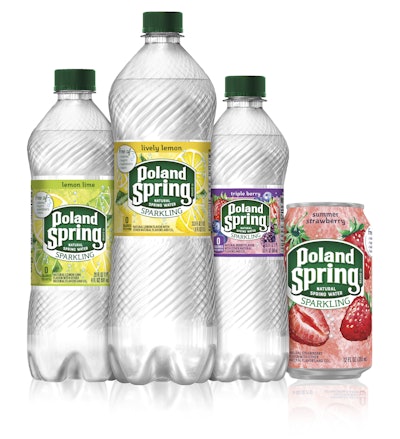
The company has launched not only new flavors, but also a brand new bottle design—and new packaging graphics, and has introduced 12-oz cans “to meet all consumption occasions and consumer preferences,” according to Susan Chirico, Regional Spring Water Brands Packaging Manager.
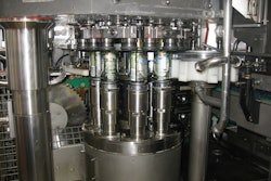
Proprietary bottle design takes the form of a sleek, elegant PET bottle that resembles vintage glass, is comfortable to hold, and highlights the movement of sparkling bubbles. Bottles are blow-molded by Nestlé Waters in an in-line process used for both sparkling and still water bottle manufacturing.
Chirico says the new bottle structure was developed as part of a collaboration between Nestlé Waters R&D in Vittel, France, and Product Ventures, a strategic packaging design agency. Packaging graphics were designed by Cornerstone Strategic Branding. (See sidebar below for Cornerstone’s perspective on the creative development process.)
Package design affects bottle labels—and caps—as well as secondary packaging, and includes the following:
• An eye-catching label that features more prominent branding and fruit imagery
• A colorful new cap that accentuates visual brand cues by reinforcing equity via its brand color that distinguishes the product from competitive offerings
• New, bold case-pack visuals that present colorful, vibrant fruit graphics designed to capture attention on-shelf and highlight flavor varieties
• Colorful fruit graphics on 12-oz aluminum cans from Crown
• Rainbow packs with popular flavor combinations in 24-pack bottles and cans to encourage flavor trial
With these changes, Nestlé Waters hopes to nearly double the number of regional spring water sparkling households by 2020 as compared to such households in 2016.
“Following rapid growth over the past few years, the sparkling water category is now mature enough for us to make a significant investment in developing this extensive line of mainstream sparkling offerings from our regional spring water brands,” says Antonio Sciuto, Executive Vice President and Chief Marketing Officer, Nestlé Waters North America.
“Consumers are choosing sparkling water at an unprecedented rate. We already have great equity in our regional spring water brands, and we hope that, as our existing customers enter the sparkling category, they will choose our brands first. With our 10 great flavor options, they now have a whole new way to enjoy the spring water they love,” he adds.
Flavors include Lively Lemon, Lemon Lime, Zesty Lime, Orange, Triple Berry, Summer Strawberry, Raspberry Lime, Black Cherry, Pomegranate Lemonade, and Simply Bubbles. The regional spring water sparkling offerings are made with water from natural springs, natural fruit flavors, and added bubbles, and are free of calories with no sugars, sweeteners, or colors.
A perspective on packaging graphics
Editor’s note: In the following sidebar story, Cornerstone Strategic Branding Chief Creative Officer Keith Steimel discusses the company’s involvement in creating graphics for a variety of Nestlé Waters North America’s packaging platforms.
From the inception, the key objective and challenge of the restage was to leverage the unique DNA of each of the six Nestlé Waters Sparkling brand while visualizing the delicious, healthy blend of natural spring water, bubbles and fruit flavors in a premium way.
In order to accomplish this, Cornerstone conducted design intelligence on the category and harnessed outside influencers to help inform and inspire the strategies for our creative range.We simultaneously developed brand stories for the teams to design against; this yielded a variety of pathways and we created robust [versions].
Creative development was followed by consumer testing. We learned consumers preferred the updated, creative expression of the natural spring water blending with delicious and bubbly fruit flavor over the current design system.
Our re-stage strategy differed from the in-market design in that a main objective was to leverage each brand’s powerful identity while continuing to drive awareness of the sparkling products as consumption rates increased. We needed to create a premium identity that complemented the core spring water products while differentiating the sparkling offerings. We showcased the strength of the trademark while visually conveying the unique properties of the fusion of fruit flavor and sparkling spring water. Coupling the branding unit with the sparkling communication ensured brand prominence while conserving space for the new creative elements.
We created a saturated, expressive, watercolor illustration style that emanates from the brand plate to capture the crisp, sparkling flavor experience. Nestlé has succeeded beautifully in developing new, great-tasting flavors, and we strove to visually bring them to life. We know consumers come to the category for taste and the sensorial experience of the bubbles, as well as seeking an alternative to CSDs, so it was essential to create an identity that capitalized on this need state.
We had a new bottle structure to work with, and were also charged with introducing cans into the category. Our graphics needed to complement the specular, streamlined, upward movement of the new bottle design, as well as consider the distinct technical aspects of printing on a variety of substrates--all the while keeping the creative integrity of the design consistent across all configurations.
Upon design approval we then customized the art elements to work with the individual configurations of each brand’s existing logo. Building the watercolor illustrations in-house allowed us to create unique depictions for 10 flavors, leading to the creation of an extremely “shoppable” identity system. In the end, the system we designed was cohesive while permitting customization on different substrates, print methodologies, and formats.
Within four months we designed, tested, and completed art for over 220 unique SKUs in 10 flavors: cans/can packs, bottle labels, shrinks and variety-pack shrinks for each format for Poland Spring, Arrowhead, Deer Park, Zephyrhills, Ice Mountain, and Ozarka brands.
To deliver a consistent execution of the creative vision in a variety of commercial print environments, we developed GMG color targets matched to the press color profiles for numerous printers/separators, and then provided hands-on, press-side support for the launch runs.