The club-store channel presents a dramatic growth opportunity for brands, but it is also a very different environment than most other retail channels. To that end, there are some important characteristics that make packaging and point-of-purchase conventions different depending on the categories and sections of the store, and particularly so when comparing those categories and store sections to other retail channels. There are three distinct sections of the club store—the front, the middle, and the back—each of which requires different packaging strategies.
The warehouse club industry in the U.S. is currently comprised of three key players: Costco, Sam’s Club, and BJ’s Wholesale. The club-store business model essentially turns the traditional retail model on its head, focusing on a large store format with spartan décor, low prices, low margins (gross margins from 8% to 14%), minimal product assortment, and extremely high volumes.
Given the low prices and low margins associated with product sales, club-store retailers generally make most of their profits from membership fees. In exchange for these fees, members expect to pay very low prices and get high-quality products. And to that end, the buyers at each of the club stores have a laser-sharp focus on low prices and “value” to the consumer. Brands selling into the club stores (or aspiring to sell in) need to always be mindful of this dynamic. If a brand sells into the club channel, low prices, low margins, and very high sales volume are a given.
Front of store (higher-ticket items)
The journey through a club store has often been described as a “treasure hunt.” This is the case whether you are in Costco, Sam’s Club, or BJ’s. There are no store maps, aisle markers, or directional signs to be found. That is a very purposeful thing. Club-store operators want shoppers to find unexpected treasures, make unplanned purchases, and generally be delighted during their time on the club-store floor. This is very evident at the front of the store.
When you first enter a club store, you will find higher-ticket items that “wow” shoppers, such as consumer electronics, jewelry, and specialty or rare items (Rolex watch, anyone?). Given that each SKU in a club store gets a dedicated pallet display, club stores generally do not stock full pallets of these higher-priced, lower-volume items. In many instances, club stores will merchandise these products on the top half of a pallet display, while filling the bottom half with stacked pallets, with a billboard-style poster or “pallet skirt” as a front panel that features branded messaging and visuals about the product. The pallet skirt needs to sell and communicate key product details and “shopper value” and is digested by passersby well in advance of seeing the primary packaging for each item.
When designing this type of display, billboard advertising principles are more relevant than typical package design principles. And notably, such a large POP display is very unique, rarely seen in other retail channels. When designing packaging for these higher-priced items, below are three things to consider:
- Billboard first, primary package second: If you are selling a product into club that has a billboard-style pallet skirt, the skirt will be the first thing the consumer sees, and from a reasonable distance. Deliver high-impact messaging and visuals first and foremost, while allowing the primary package to cover the details. If you have multiple products merchandised next to each other, make the pallet skirts and primary packages consistent and complementary. Photography/product styling, typography, colors, and layouts should all complement one another, if appropriate.
- Stopping power is king: The key to packaging in this context is to stop the consumer in the aisle with a quick communication on the pallet skirt. Just like a highway billboard, designs should ideally have short, concise primary statements or slogans, and large, dynamic visuals. Don’t worry about all the details; those can be delivered on the primary packages.
- Value is queen: While billboard advertising principles are a must, value proposition always needs to be a focus. Both buyers and consumers will demand to know the value that a given SKU at club will deliver, in a quick, clear, and impactful way.
Middle of store (non-perishables and household items)
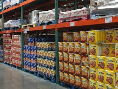
The middle section of each store contains items such as non-perishable food products, kitchen items, home décor, and cleaning supplies. In most cases, these products are stacked on pallets from top to bottom with no pallet skirts. In these instances, the front of the pallet as a whole is the real front-facing display, while individual primary package facings coalesce to create a pattern on the front of the pallet. Moreover, in some cases primary packaging is housed in corrugated shipping cases, and the front of the pallet becomes a pattern of corrugated cases together with the primary packages inside of them. Below are three recommendations for designing for these categories:
- Design with the full frontage in mind: In the middle section of the store, primary packages are typically stacked on top of each other to create full pallet displays. In this context, individual package designs are not as relevant as the pallet pattern that is created when combining all of the individual packages into one large pattern. Individual packaging designs should be optimized to work together when stacked on a pallet configuration. Accordingly, your designers should be showing you both individual package designs and pallet patterns where individual packages are stacked to form a pallet display.
- Communicate in five seconds, from five feet away: While this is a general rule of thumb when designing across all sections of club stores, it is particularly relevant in the middle of the store. The front-of-pallet display, as a whole, needs to clearly communicate brand, contents, and value proposition quickly and from a reasonable distance. Five seconds and five feet away is a good rule of thumb. This will require your designer to prioritize key communication points and deliver these points clearly, while breaking through the noise that the pallet pattern will create.
- Corrugated cases are critical: When products are stacked on pallets inside corrugated cases, it is extremely important to consider the pallet pattern that is formed with the front of the corrugated cases showing. The front sides of the corrugated cases need to complement the primary packages, while together forming a strategically designed pattern for the pallet as a whole.
Back of store
In the back of most club stores, shoppers will find frozen and refrigerated foods, produce, baked goods, and other items. With respect to frozen and refrigerated foods, most of these products are displayed in larger corrugated shipping cases within the freezers/refrigerators. The lighting in club stores is generally hit or miss (they are warehouses, after all), but in the freezer section, lighting and visibility can be particularly problematic. Products in the freezer are displayed behind glass that is often foggy and poorly lit, while the refrigerator section comes with its own challenges.
- Corrugated is critical: When frozen and refrigerated products are displayed in corrugated shipping cases, in most cases the primary packages are at least partially obscured on shelf. In those instances, the first thing in the consumer’s line of sight will be the front of these corrugated shippers. This stands in sharp contrast to packaging for similar products in other retail channels like grocery, where individual products are displayed on freezer and refrigerator shelves in their primary packages (in most cases). Accordingly, it is critical for your designer to optimize the corrugated cases to quickly communicate your most important selling propositions.
- Start simple: Given the limited real estate on the front of a corrugated shipper, visuals and copy should be limited and simplified. Communication hierarchy should be carefully constructed to highlight two or three quick points that are clearly and simply communicated.
- Contrast is key: To stand out in a dimly lit and potentially obscured freezer or refrigerator case, the corrugated case and primary packaging must be bold. Boldness can come through contrast, whether contrasting colors and/or visuals. In any event, you should avoid light colors with light pictures or text at all costs.
Kory Grushka is Director of Business Development for Works Design Group.