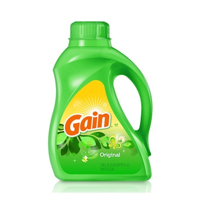
Procter & Gamble’s Gain Laundry Detergent is a billion-dollar brand, largely built on its consumers’ love for the product’s fresh scents—Lavender, Ocean Breeze, Island Escape, and Apple Mango Tango, among them. But in 2015, the brand wasn’t dressing the part. That’s according to Chris Lowry, President of Chase Design Group, which was chosen to refresh the brand packaging.
“At that time, the laundry category focused on cleaning efficacy, and the Gain packaging fit that mold,” says Lowry. “Unlike many laundry shoppers, Gain consumers love scent, but at the time, the package didn’t clearly communicate the great scent inside.”
The core requirement for the redesign was to delight consumers and clearly convey the fresh scent profiles. The project encompassed 174 SKUs and included all of Gain’s product forms, including laundry detergent in a rigid plastic handled bottle, fabric softener in an hourglass-shaped rigid container, and Gain Flings! detergent pods in a round plastic tub container.
A key element of the project was the new logo. Gain’s existing logo was masculine and sharp, like many of the performance-positioned category logos. Chase updated the logo to a playful, friendly letterform along with a sunburst logo to better reflect the brand’s expressive scented products.
Label graphics include lively and distinctive scent visualizations—flowers, ocean waves, and apples, for examples—against vibrant, color-drenched backgrounds. According to Lowry, these distinctive visual identity elements also bring the same brand sensibilities to other communication touchpoints for the brand.
The new package graphics for Gain were launched in 2015 to positive response. Says Lowry, “Gain continues to grow at retail, and consumers regularly express their love of Gain’s products and packaging in social media.”