In creating the brand identity for a new line of tanning lotions and complementary skincare products from U.K.-based Gerrard Intl., design firm Pearlfisher London conceived a soothing, sophisticated style to convey a reassuring experience “in a world where tanning can be seen as complex, frenetic, and full of potential disaster,” the company says.
“The majority of self-tanning products are either brash or simple,” relates Pearlfisher Creative Director Sarah Cattle. “Kissed by Mii has been designed to be more calm and sophisticated, which quells previously common worries about the smell, shade, and longevity of different tanning brands.”
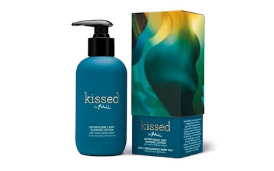
Kissed by Mii is formulated for use in spas, salons, and at home and comprises 12 SKUs, including an exfoliator, a mitt, gloves, moisturizers, and tanning lotions in two shades for all skin tones. The lotion is made with marine minerals such as coral seaweed extract and exudes a fresh, marine scent.
In explaining Pearlfisher’s design approach, Cattle says, “When done well and with consideration, a tan makes us feel like we are a better version of our natural selves. Therefore, Kissed by Mii needed to bring to life the positive and emotionally enriching experience that reflects the feeling we have when we’re tanned.”
With that in mind, Pearlfisher Senior Designer Vicki Willatts created an illustration for the cover of the product’s telescoping carton that uses a pattern of undulations, like swaths of silk, in saturated hues of teal, gold, and magenta. Tanning lotion products are signified with a teal and gold shades, while pre- and post-tanning products, such as moisturizers and exfoliators, are magenta. The base of the secondary carton is a matching solid color, with the brand logo in gold type.
“Teal has been used for the tanning products to represent the unique marine minerals contained within,” says Cattle. “The sophisticated touches of gold in the identity and illustration reflect the glow of sun-kissed skin.”
The carton cover is litho-printed in five colors plus matte varnish in CMYK and PMS gold, while the base is printed in two PMS colors, plus foil and matte varnish. The inside of the base is also printed with PMS gold.
Primary packaging for the products includes pump bottles and tottles in teal and magenta.