Despite being a Baby Boomer at 60 years old, with its dynamic new branding, legacy nutritional supplement brand Geritol doesn’t “look a day over 40,” says Cigdem Topalli, Brand Manager, Dietary Supplements for Meda Consumer Healthcare, owner of Geritol since 2010. “Not only is the packaging beautiful, but it’s also easier for people to shop and quickly delivers the benefits and point of difference,” he adds.
In summer 2012, Meda brought in design firm Little Big Brands to create a package design for its liquid and tablet supplements to appeal to a younger demographic and strengthen the brand’s shelf impact and shopability. “Geritol had not been actively marketed in many years,” explains Little Big Brands Creative Director John Nunziato. “Meda knew the brand image was outdated and approached us to help them relaunch Geritol in packaging relevant to the audience and category.”
Initial work involved research to assess the brand equities in order to support and guide the packaging design. Nunziato says that despite neglect, Geritol had retained a healthy brand awareness and was perceived as a trusted product.
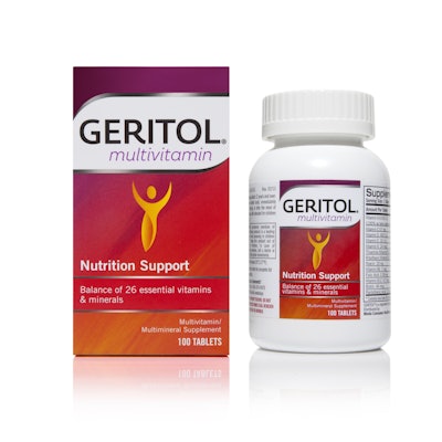
During the redesign, the liquid and tablet supplements—containing nearly 100% of the recommended daily value of 12 essential vitamins and minerals for men and women—remained unchanged; however, a more intuitive naming system was developed. Geritol Complete became Geritol Multivitamin, and Geritol Tonic became Geritol Liquid.
One of the main brand equities retained by Little Big Brands was Geritol’s red color palette—with some dynamic adjustment. “We took the one-dimensional red brand color to a new level, realizing it as a vibrant palette grounded in rich red, but stretching from orange to purple, bringing life to this often lower-shelf brand,” says Nunziato.
In addition, the Geritol logo was updated as a lighter, easier-to-read mark, and was given some “breathing room,” Nunziato adds. Gold ink was transformed into a silver foil stamp that surrounds the logo in a fluid shape, with foil also highlighting key communications lower on the package. Gender-neutral, stylized human-figure iconography, positioned on the center of the front panel, was also developed to support the brand promise of energy and vitality. Icons on the back of the pack highlight Geritol’s immune system, energy, and bone health support.
“Geritol is a phenomenal product that consumers were starting to ignore because it just looked really dusty,” says Nunziato. “We worked hard to move the brand forward in a way that would increase loyalty with current consumers while becoming relevant to an entirely new audience.”
The new package graphics, introduced at retail in October 2013, are used for paper labels dressing 40- and 100-tablet bottles and 4- and 12-oz liquid bottles, and on secondary paperboard cartons.