Ask consumers to envision a brand, any brand. This isn’t a meaningless exercise. The information it divulges is important, and it’s surprising that marketers don’t solicit this kind of feedback more often. Here’s the rationale: People are visual. Strong visual design assets stick with consumers more than verbal communication. That’s why packaging plays such an important role in the marketing mix. It makes the brand tangible to consumers and creates visual recall in their minds. When asked to envision a brand, quite often, consumers will call the packaging to mind. Not only that, they will recall specific visual aspects of the packaging.
Think about what happens in advertising. Products are usually depicted either being enjoyably consumed or being put into use, depending upon the category. Close-ups of product packaging are shown, often more than once, so that consumers can recognize it in retail environments. Over time, with repetition, the packaging and its visual assets are firmly associated with the brand. That’s great until these products appear in retail stores surrounded by competing brands.
Even though advertising helps to build brand recognition, purchase decisions are ultimately made at the retail shelf where competition among brands is fierce. Packaging that is visually dominant and convincing gets consumers’ votes. It sells the brand above all of its competitors’ brands. Visual cues are honed in on before verbal brand communication is, making it extremely important to ground the package design with the correct imagery, an icon or visual hook, typography, and color to deliver real impact.
Too much consumer product packaging fails to attract the eye, ensuring that every bit of verbal brand communication that might be a difference maker in purchasing one product versus another goes unread. Hence the power of visual versus verbal brand communication.
The look of visual success
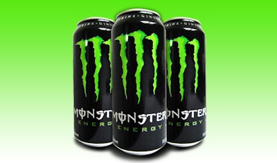
Some brands get packaging right from the beginning. Do Monster Energy Drinks capture consumers with the tagline, “Unleash the Beast,” or does the product’s distinctive packaging come to mind first? It is the Goth font for “Monster,” with its one-of-a-kind letter “M” formed by neon green “claw marks” on a black can, that symbolizes the brand and all that it stands for. In spite of the explosive growth in the energy drink category, Monster continues to hold its edge; its visual impact pulls in consumers with one brief glance. Here’s the proof: If the Monster brand identity was removed from the can and only the claw marks forming the “M” were left in place, I’m betting a large number of consumers would still be able to identify the brand.
Nickelodeon uses a similar visual device in the brand identity for its popular Winx property and its brand identity. When seen on Winx toy packaging, the fanciful pink letters with the “X” shaped like gossamer fairy wings deliver the brand and all of its ethereal qualities. This brand identity is set within an oval circle. This is replicated with shiny, ring-like circles used to call attention to every important visual and verbal brand communication on Winx packaging. Legions of young girls who are Winx fans can identify the brand and call to mind its characteristics with these simple visual devices that are immediately recognizable—even from a distance.
One-of-a-kind brands have leveraged the full power of their packaging to get their image and message across. Think about the Axe brand aimed squarely at young, hip men, and now women. The edginess of the brand is on full display in its packaging—a stand-out in crowded retail environments. A unique package structure and signature color, and a strong brand identity all work synergistically to give strong visual expression to the brand. They attract the eye and sell the brand. While supported by verbal communication, fans are sold by the visual representations of these brands alone.
The same is true for some licensed consumer product brands. Mattel’s Barbie’s signature pink and distinctive brand identity always stand apart on the shelf. So does merchandise bearing the Star Wars license. Or the Toy Story franchise. No matter how many products crowd store shelves, brands like these lead with a powerful visual presence. While supported by appropriate verbal brand communication, the visual aspects of licensed package design for brands like these draw in fans and have the power to make the sale without much else.
Rethinking packaging for more visual punch
Fisher-Price is a classic, beloved toy brand for generations of infants, toddlers, and preschoolers and a favorite of parents. But the brand was in need of a package design refresh. A new package design system was developed around the concept of “The Joy of Learning.” The iconic Fisher-Price brand identity with its white typography on a red, scalloped ground remains unchanged; it is positioned in the upper left-hand corner on all packaging. Simplified verbal messaging and larger photographic visuals that actually show infants, toddlers, and preschoolers playing with the toys tell consumers what they need to know at a glance. Cutouts in circular or rectangular shapes show key elements of each product, supported by limited, selective verbal brand communication.
What’s most impressive is the clear package segmentation by age appropriateness for each toy. Yet the package design system provides a cohesive look for the brand, which is important. Fisher-Price’s new packaging helps to visually seal the deal, not only stateside, but also around the world, as a global brand should. This is simplified packaging that is unique and well designed, and really functions effectively.
Why should commodity items be a yawn? Mundane items like dish soap and hand wash needn’t sit on the retail shelf in a sea of uninspired packaging. One edgy brand that continue to up the ante on commondity packaging is Method. The brand’s disruptive package structure and the art of Irish designer Orla Kiely elevate packaging on everyday products to a whole new place. Limited-edition designs that include colorful floral, fruit, and leaf patterns on clear, unique packaging is too beautiful to throw away. It's meant to be left out and reused. With nothing else like it in retail stores, consumers immediately gravitate to the freshness of these products. Little verbal communication is even needed. But here’s the bottom line: Why would consumers buy any other category brands when Method, Monster, Winx, or Axe are so visually dominant and emotionally persuasive?
Ted Mininni is president of Design Force, Inc., a package and licensing program design consultancy to the consumer product and entertainment industries. He can be reached at 856/810-2277.