Earlier this year, the Centers for Disease Control and Prevention (CDC) reported, “As of mid-January 2013, flu-related hospitalization and death rates among people 65 and older increased sharply.” Of course, influenza affects people of all ages and has garnered considerable media attention this winter.
For generations, Contac has provided fast-acting, multi-symptom relief for cold and flu sufferers. But this season, Marietta, GA-based Meda Consumer Healthcare Inc., the U.S. over-the-counter division of Stockholm-based Meda AB, has given the venerable brand a package design facelift.
Meda’s product family includes OTC products and dietary supplements, with brands that include Geritol, Feosol, and Contac.
Like it did with its Feosol iron supplement packaging, Meda sought the expertise of Little Big Brands to give the product a new look on the shelf that would increase shoppability for the consumer and create a stronger brand presence in a saturated category.
“Contac was confusing to shop and that’s a real problem when your consumer is likely feeling under the weather to begin with,” says Shanta McGahey, brand manager, Meda Consumer Healthcare. “The new Contac takes a great stride forward to instill confidence in the brand and help consumers feel better faster by getting the right product into their hands quickly.”
Color, clutter add to consumer confusion
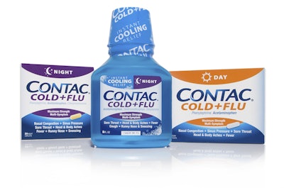
The first step in the design process was assessing the line to determine what could be enhanced, and what needed an overhaul. The biggest challenge was color. The daytime non-drowsy product was dominated by dark purple, and the nighttime product by a bright orange. Intuitively, it didn’t make sense, nor did it follow category norms. In the redesign, the SKU colors were flipped and bold icons were added to the top of the pack to clearly designate day/night.
But wouldn’t such a reversal add to consumer confusion? “Given the large number of consumers that were having difficulty shopping the brand and category, this wasn’t really a concern,” says Blake Hawley, Meda’s brand marketing director. “We felt confident that we could only improve on the situation. In addition, intuitively, most people would consider dark colors to cue nighttime and light to cue daytime.”
The overall architecture and communication hierarchy was stripped down to drive home brand, SKU, and symptom relief, making it a quick read for the consumer, as well as forming a strong brand block and a solid base for the introduction of new products. The Instant Cooling Relief Liquid line extension was created to align with the base brand but carries the addition of frosty snowflakes to mimic its instant cooling sensation. The updated Contac logo is true to the original with a bit more action to cue healing.
“Sometimes the most successful redesigns have nothing to do with how much you change, and everything to do with simply changing small elements that aren’t working,” says John Nunziato, creative director, Little Big Brands. “This project is a great example of why our partnership with Meda has been so successful, because we have the same goals in mind for their brands—solve challenges for the consumer, and increase profitability for the company.”
Discussing package design in the OTC cold and flu category, Nuziato says, “It’s a category of more equals more—more copy, more claims, more ingredients, more colors, and more swoops. Because we’re talking about medicine, there are a number of restrictions and guidelines that must be followed, which can make for a complicated front panel. There are also quite a few brands that live in the cold/flu section of the store, all with multiple offerings. That makes for one confusing aisle for a sick individual to shop. With the redesign, our goal was to help the consumer; to give them color coding that made sense, large icons to reinforce day/night options, and architecture that cleanly and clearly provides symptoms and ingredients.”
The new packaging is now available at major drugstore and supermarkets, as well as local and regional retailers. The product is sold both in the U.S. and Canada. Contac is available in Daytime relief (8- and 24-ct solid dose), Nighttime relief (24-ct solid dose), a Day/Night combo pack containing 16 day and 12 night solid dose meds), and new Instant Cooling Relief Liquid. No price changes resulted from the package design facelift.
No package structural or supplier changes were necessary to accommodate the design changes. Meda says it has a complex list of suppliers, with details considered proprietary. The company does say it uses external contract manufacturing organizations to produce and package Contac.
Moving forward
Meda’s Hawley says, “The updated brand look is much more confident and trustworthy. It elevates the brand image, helping consumers feel good about the product inside. The new line look gives us a platform to grow the brand. We have a consistent brand now that is easy to shop and opens the door for new product innovation and line extentions.
“As a company, we’re excited about the future of Contac. With the redesign, we now have a brand that has an ownable, standout look on the shelf, along with a brand new offering in our Instant Cooling Relief Liquid. Consumers can feel good about buying us, and retailers should feel that we are listening to them and creating value in our category.
“We listened to our customers. We understand that if you are shopping for cold medicine, you want to find a solution and find it fast. The new and improved Contac answers that call.
“Retailers have been very positive on the graphics upgrade and appreciate the simplified communication. As boxes just started hitting shelves, there hasn’t been time to gather consumer response yet.”