A well-designed packaging program and a style guide that supports its standardization are necessities, not luxuries. They can and should ensure that a cohesive package design system is put in place for a brand to avoid consumer confusion. Creativity is great, but it has to be harnessed and directed, otherwise one-off package designs may end up being developed that do not refer back to the brand.
Think about how many consumer products appear in any given category; how can one brand stand out among many? Then think of the wide range of consumer product categories in which a single licensed property might be leveraged. Without a standardized packaging program, all kinds of package solutions might appear, all unrelated to the brand and to each other. How would the package look if merchandised within a shelf set or within the appropriate departments in retail stores by category? Like a jumble of unrelated products? No brand recognition results in no purchases. This simply isn’t an effective way to fully develop a brand—licensed property or not.
Fortunately, most brand owners know this. They have standardized packaging style guides in place. But even that might not go far enough. No, this isn’t an argument for making the guidelines more rigid; rather it is the opposite. Too rigid a style guide doesn’t allow for enough flexibility for brand expansion into new categories that might require very different package structures, and it may not allow licensees to properly market their products. Not every product’s benefits and features are clearly delivered with a simple callout. Some may need a series of visuals to convey how a product works or how it’s used, a strategically placed “try me,” or more space for brand communication.
Standard styles, flexible formats
It’s not enough to provide visual assets to brand owners and licensees with one package example and expect them to know how to utilize them as they develop their consumer product packaging. The overall visual approach should stretch to encompass key consumer product categories. It should also make allowances for retailer exclusives or co-branded products. Showing examples of how these might be implemented is beneficial.
When it comes to licensees, it’s crucial to support them in style guide implementation rather than to reinforce restrictions. The style guide should demonstrate that they are valued partners and should assure them that their packaging will align with that of every other licensee’s products, regardless of category, leading to greater brand recognition and sell-through. Showing examples of a blister card, a closed box, and a window box configuration, as well as hangtags establishes guidelines that keep the licensed brand cohesive. Translation: It keeps the brand easily identifiable at retail, which is far more likely to spur purchases.
The style guide developed for Showtime’s Dexter drama series offers a good example. One option for licensees leverages the show’s star, Michael C. Hall, in character, gesturing to his audience to stay mum about his identity as a society-friendly vigilante, so there is immediate recognition of the Dexter brand. It is further reinforced by key visual assets: A pool of blood that works to contain product descriptors, as well as blood spatters on a stark, white ground around the brand identity speak to “America’s favorite serial killer.”
Another option depicts Dexter peering at his audience from the inside of an unzipped body bag. Seeing Dexter from the victim’s point of view is an attention grabber. The same pool of blood and blood spatters are used, since these powerful visuals are ownable elements of the Dexter brand. Various packaging configurations are illustrated, as well as blister cards and hangtags, to show how the brand’s visual design assets can be incorporated, regardless of product category needs. As long as these visuals assets are used, there is flexibility where packaging configurations are concerned.
Effective style guides
Standardization guidelines demonstrate how brand identity, package design architecture, callout bursts, fonts, insets, color palettes, character art, and background imagery work together, ensuring the package design system’s successful implementation. Consistency and standardization don’t have to be boring. In fact, companies should consider developing packaging that becomes “ownable.” Distinctive package structures can be developed for each product category. Well-presented style guides help strengthen brands that might otherwise fall into the commodity trap by establishing package design systems to accommodate multiple product categories for major brands. This applies to private-label as well.
Great examples abound in the toy category. Hasbro’s Transformers’ key visual assets—a techy brand identity, a signature color palette, and the highly detailed computer-generated character illustrations, as well as the Autobot and Decepticon shields—tie Hasbro’s Transformers toys and Transformers licensed consumer products together, regardless of category, even though each category features its own distinctive package structure. So package design has a cohesive look, clearly giving visual expression to the Transformers brand, yet it’s flexible enough to accommodate any product category.
No matter how many new princesses Disney presents to dazzle little girls, no matter how much proprietary and licensed Disney Princess merchandise hits the marketplace, a deep-pink signature color is used in “fabric” borders with scrolled flowers, vines, and satiny ribbons to reinforce the Princess brand. The principal visual design element is a sparkling, scrolled, diamond-studded tiara that appears toward the bottom center of all packaging. Regardless of how many licensed products come into the marketplace, these elements allow for instant recognition of the brand.
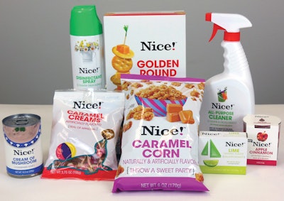
One example of effective design standardization in the private-label sector is Walgreens’ Nice! brand. Recently, Walgreens decided to phase out a hodgepodge of private-label brands in its stores so it could deliver one dominant, easy-to-shop brand. Nice! made its debut in 2011. Walgreens developed a clean, contemporary, and simple package design system to stand out from every other brand in every category, including food and beverage, paper products, and household products. All-white packaging and a brand identity in crisp, black lettering stands out; especially when surrounded on retail shelves by a plethora of brands packaged in every color and hue. Crisp visuals of the product—often cleverly or whimsically depicted to reinforce the brand—instantly tell the consumer what’s in the package. Brand communication is simple and direct, and delivers a few, carefully chosen sales points.
It’s obvious that there’s a package design system in place for Nice! that is clearly the result of a well-developed style guide. The Nice! brand identity appears in the same position from package to package. It remains the same size on most packaging. But the package and environment changes to reflect the product and its function. As a result, color changes and imagery changes are very clear. Even the dot on the Nice! exclamation point changes color to reflect the segment color. This clearly differentiates the product lines, suggesting that Walgreens has offerings for consumers in every category.
Remember, people are primarily visual, and as shoppers, they make purchase decisions in a scant four to six seconds. Few packages on the retail shelf can be scanned within that short time period; experts say that consumers take in five or fewer. A packaging structure that involves a standardized, distinctive shape, graphic architecture, and color palette enables consumers to easily and readily identify a specific brand. How important is that in a few seconds’ time for national, private-label, or licensed brands?
Standardized packaging and a style guide take present and future needs into account, as well as potential line extensions, and package shapes, sizes, and materials. They provide all of the support and visual design components necessary to present cohesive brand packaging while being flexible and promoting creativity. Laying this groundwork leads to package design systems that elevate brands to category leaders. This is the secret to developing the most effective style guides for package design.
Ted Mininni is president of Design Force, Inc., a package and licensing program design consultancy to the consumer product and entertainment industries. He can be reached at 856/810-2277.