New Tool: ProSource
Checkout our packaging and processing solutions finder, ProSource.

Oat Works package design highlights benefits, not 'bores'

Vibrant, fruity colors and modern, bold typography moves oat and fruit-based smoothie packaging away from oat clichés, to reflect product’s taste, smoothness.

Pw 43330 Oat Works

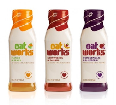
The design for Oat Works, an all-natural fruit and oat smoothie distributed in the U.K., uses vibrant color to reinforce the ingredients in each of the three flavors and emphasize the great taste cues. The background pack color is a beige tone to highlight the core oat benefits of the brand. Similarly, the oat is championed in the “O” of the Oat Works identity and on the bottle’s clousre. The ingredients of each variant are also brought to life through shapes inspired by the contours of oats. The heart icon on the front of the pack draws attention to the natural and heart healthy properties of the product, providing consumers with the information they need to know about Oat Works’ health benefits.

Tess Wicksteed, strategy director at Pearlfisher, the package designer, comments, “Our task was to take oats to the next level, showing that Oat Works delivers all of the benefits but none of the bores. The design moves away from current oat clichés, using bold, rich, and modern typography. We have communicated the smoothness and taste of Oat Works through vibrant, fruity colors and icons that reflect flavor. A future-focused design for next-generation oats!”

Source: Lovely Package

Discover Our Content Hub
Access Packaging World's free educational content library!
Read More
Discover Our Content Hub
How Can You Honor a Leader?
Induction into the Packaging & Processing Hall of Fame is the highest honor in our industry. Submit your leader to be considered for the Class of 2024 now through June 10th. New members will be inducted at PACK EXPO International in Chicago
Read More
How Can You Honor a Leader?