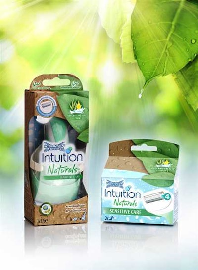
Schick Intuition Naturals
A departure from the plastic clamshell packs typically used for wet-shave razors, packaging for the Schick Intuition Naturals line of razors uses a carton made from 55% post-consumer recycled paperboard printed in 10 colors, with 25% PCR PET for the window and inner tray. The flat face of the window allows for a clear view of the product, without the many reflections often seen on contoured, front-blister packs. The choice of brown board for the carton gives a natural and sustainable impression, selected to go hand-in-hand with the natural moisturization feauture of the product. Printed water droplets on the outside of the board not only tie the product to its sister Intuition products, but also convey the moisturization the user will get when using the product. Package colors were chosen to enhance the outdoor and natural experience of using the product.
Lip balm pack mimics nature’s perfect package: the egg
eos—a “lip balm that makes you smile”—according to the company, is a new 95% organic, 100%-natural, paraben- and petrolatum-free product packed in a smooth, egg-shaped container with a velvety, matte finish. The sphere, with a flat bottom that allows the package to rest on a tabletop, is available in seven juicy flavors that complement the seven lip balm varieties—among them lemon drop spf 15, honeysuckle honeydew, and strawberry sorbet—and has a handy finger indent that makes it easy to twist off the cap.
Test tube-shaped package for cosmetics
Athens, Greece-based pharmaceutical company Frezyderm is utilizing packaging design to underline the efficacy of its product formulations. Specifically, it employs a Show Bottle for its premium range of OTC skincare treatments that combines airless cap protection with a test tube shape designed to inspire consumer confidence. The Show Bottle’s striking spherical bottom is visible through a transparent outer base. With an inner bottle and polypropylene actuator, it is compatible with a wide range of products. Patented airless technology protects the formula’s integrity and eases dispensing of high-viscosity formulas. The packs feature a metallized ABS (acrylonitrile butadiene styrene) collar, a white PP inner bottle, a clear SAN (styrene acrylonitrile) outer, and a white PP actuator.
Simple hair care for all reflected in refreshed PERT label
A shampoo and conditioner in one product for use by all family members is an unusual find in the hair-care category, whose retail shelves are typically cluttered with countless brands and product variations. While PERT Plus, introduced in 1987 as the first 2-in-1 shampoo/conditioner on the market, can claim this unique distinction, until recently its on-shelf presence was less than stand-out. But a bold new brand identity now has the product popping off the shelves. Central to the package refresh is a bold and modern logo, positioned vertically on the label that consumers say demonstrates renewed confidence in the brand. A fresh, eye-catching bubble pattern on the label background signifies that the product actively works, so people don’t have to think about it. Bright colors differentiate five PERT Plus varieties and express the confidence and upbeat attitude of a great hair day. A prominent, horizontal silver bar calls out the 2-in-1 proposition in a premium way.
Self-closing pump serves Weleda’s new BIB body lotions
The Weleda Group, of Basel, Switzerland, recently selected airless, self-closing dispensers with an 0.8-mL dosage for its latest launch of four body lotions. Premounted, customized caps include the Weleda logo, while a snap-on ring with 35-mm outer dia was developed specifically for coextruded bottles with 200-mL inner bags (bag-in-bottle). The airless customized cap and collar underscore the company’s ability to develop packaging solutions that provide formula protection and standout shelf appeal. With BIB technology, and the airless, neutral dispenser design, users can enjoy complete 360-deg application, exact dosing, efficient evacuation, and formula stability over the life of the product, without discoloration, clumping, or clogging.
Glass provides striking appearance for anti-aging product line
Glass packaging provides a distinctive, sleek appearance for Yves Saint Laurent’s new anti-aging line, Forever Youth Liberator. The packaging supplier produced three crème jars and three glass flacons (bottles) for the serum, each in 15-, 30-, and 50-mL sizes. The crème jars and flacons differ in terms of the spray technology used. A hatched aluminum layer under a pink layer was selected for the crème jars, while bottles feature an additional brown coating, and the Yves Saint Laurent initials as a further sophisticated detail. The initials YSL and the name of the line are screen-printed on the jars and flacons, with the YSL letters combined in a vertical line.
'Chocolate toothpaste' in a tube
Offering an alternative to consumers concerned about the risks of ingesting fluoride, Theodent relies on cocoa bean extract to achieve a level of tooth cleaning equal to fluoride products, but has a traditional mint taste as opposed to a chocolate flavor. The “chocolate toothpaste” is housed in a sophisticated tube whose angular shape and shallow depth afford a sleek yet professional appeal. The tube is a five-layer coextrusion that includes ethylene vinyl alcohol. The head of the one-piece tube is triangular, with dramatic hard edges punctuated by one of the most complex caps ever commercially produced. The injection-molded polypropylene cap includes a flexible plug that, when closed, squeezes into the tube’s orifice. Its pintle then expands slightly for an especially tight seal. The cap also has an aluminum overshell.
L'Oreal shampoo line gets a whole new look
The Pureology redesign takes the form of a sensuously curved, innovative set of high-density polyethylene bottles; one sits on its cap, the other on its base. The bottles are injection-molded of 50% post-consumer recycled material from a single mold and appear to embrace on shelf. The creative brief for Pureology presented two challenges. First, give the brand, whose original structure was inspired by classic olive oil bottles and had not been redesigned since its purchase by L’Oreal, a modern, upscale look cool enough to be sold at high-end Paris shops. Second, correct a structural design flaw in which the thin-necked bottle prevented the popular flash-foam effect of the luxuriously viscous liquid. L’Oreal wanted the new Pureology bottle to appear organic and natural in form, while looking different from all other salon products.
Panasonic personal grooming tools return to Target in new packaging
New packaging in Target stores for the Panasonic Wellness Group’s personal tools was crucial to the brand. The line had been dropped after a new Target buyer found its pink packaging to be out of date. To regain entry into the fashion-forward chain, Panasonic was asked to present a redesigned packaging system embracing the spirit of the contemporary young woman. Phase one design development began using black, white, silver, gold, and a touch of pink in different package configurations, some with windows, others without, for which Panasonic and Target strongly advocated.
Package design helps Help Remedies launch into national distribution
Help Remedies, a New York-based creator of minimalist OTC medicine, is communicating the message that less—less drugs, less dyes, less coatings—is sometimes more. The company’s statement, "Take Less," calls out “big pharma” for its excesses and promotes the idea of moderation in OTC drugs. The packaging is not only visually pleasing, but one touch offers a sensory delight as well. “Texture is an important aspect of Help’s approach to packaging,” says Kimberly Oliver, the company’s consulting communications director. “Instead of the hard plastic prevalent in the OTC drug category, Help’s paper pulp clamshell is soft, tactile, and non-threatening. The rounded edges also contribute to the inviting nature of the packaging. Help is meant to be comforting, with textures that people instinctively reach for when they aren’t feeling well.” The packaging incorporates Plastarch, or PSM, a biodegradable thermoplastic resin Oliver describes as “corn-based starch combined with several other biodegradable materials and modified in order to obtain heat-resistant properties.”
Co-packers help AccuDial and PediaCare innovate with kid-medicine dosing packs
Bio-Pharm, a supplier of generic pharmaceutical formulations, is packing a new a line of liquid OTC medications for AccuDial Pharmaceutical that the company calls a “revolution in over-the-counter dosing.” The innovation is a two-part label that allows users to twist an outer label and essentially dial-in a precise dose in milliliters of a liquid medication based on the child’s weight.
Slider pack offers innovative option for herbal stress remedies
OTC healthcare manufacturer Lanes Health turned to Brecon Pharmaceuticals to package the latest extension to its Kalms range of traditional herbal stress remedies—Kalms Day—into a slider pack. The pack delivers a compact solution that retains the patient information and blisters, while being durable, engaging, and making all components easily accessible “Traditionally, the Kalms product range is packaged in glass bottles and standard blister packs. However this latest range extension required a completely different packaging approach,” says Hilary Lynn, senior product manager at Lanes Health. “It was vital that we maintained our brand image, while presenting our product in a highly portable and durable format that would stand up to the wear and tear of being carried around in bags or pockets.”
Feminine care ‘Designer Series’ reflects a girl’s personal style and fashion sense
Kimberly-Clark is extending the U by Kotex* and U by Kotex Tween* feminine hygiene lines with U by Kotex* Limited Edition Designer Series. Four distinct new products and designs capture young women’s personal style with trend-forward colors and patterns, keeping her interested by creating surprise, delight, and variety on shelf. High-contrast colors and vibrant patterns envelope each package and reflect individual fashion trends— poptimistic, boho, and freestyle for the three pad designs, and punk glam for the tampons. The iconic U by Kotex* black logo stands out against the saturated colors and is accompanied by a black bellyband that wraps around the package, creating a ribbon, gift-like effect.
Lip exfoliator massages dry lips with vibrating tip
The Socializer’s Can You Keep A Secret? lip exfoliator and conditioning balm from Elizabeth Grant Skin Care is a dual system that consists of a gentle exfoliator and a lightly textured deep conditioning balm. According to the company, what makes this product so unique is the inclusion of a vibrating exfoliating tip. Once the black dial is twisted to release the natural, rice-based exfoliating gel, the lip buttons on the tube are pushed to activate the gentle vibrating pulses—giving lips a one-two punch for dry skin removal. In addition, the deep conditioning balm is attached to the vibrating exfoliator with magnetic technology. Users can either keep it attached or pull the lip balm off and take it with them for easy, on-the-go beauty.
Burt’s Bees employs potato starch-based tray for personal care kits
As one of the top brands in natural personal care, Burt’s Bees believes all packaging should hold to
the highest standard possible of environmental
sensitivity. As part of their continued
development of sustainable packaging
alternatives, they replaced the petroleum-based
PET thermoform tray in their product kits with a
more sustainable option believed to be a first in
the health and beauty category: a potato starch-based tray. According to the company, this innovation not
only improves the aesthetics of the finished
package—a must for the category—but it also
represents a sustainability win by using a renewable, recyclable, and compostable material for a key component used for product protection and display.