Sterling Anthony, CPP
In a parallel universe, on a fantasy Earth, every CPGC has a live salesperson stationed in the store aisle, promoting the product to the consumer. On the real Earth, however, that role is performed by packaging, the silent salesman, from store shelves. Under both scenarios, the objective is to communicate a message that's coherent, cohesive, and most of all convincing; but specific to packaging, the mismanaged use of symbols clutters and garbles.
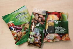
The sustainability era, in particular, has spurred the increased use of symbols, for example, those of third-party certifiers of compostability and of energy-offsets. But there are other symbols out there, too. For example, if a product is organic or if it's the official product of some organization it may carry a symbol, too. Symbols on a package can be as distracting as tattoos on the face of a salesperson; and although quantity, type, and combination are key factors, a single symbol might be too many.
That's because a major function of packaging is that of a marketing tool, meant to induce the consumer to purchase; therefore, any symbol on the packaging should justify its presence by contributing to that inducement. Some might argue that as long as the symbol doesn't do any harm, there's no problem. Even if that determination could be made, if the end-effect of the symbol is neutral, why waste the ink? Whether a symbol is a contributor hinges on the consumer's knowledge, attitudes, and beliefs.
Knowledge. By function, a symbol is a graphic that stands for something other than itself, thereby requiring interpretation. The consumer should not have to wonder, "What does this symbol mean?" Nonetheless, some symbols—some artistically rendered—put the consumer exactly in that position. In the packaging realm, universal symbols are rare, and probably what comes closest are the recycling symbol (the green triangle of chasing arrows) and the prohibiting symbol (a bordered circle with a diagonal). The rest of the symbols, to varying degrees, require learning and/or experience on the part of consumers to be assigned meaning.
Attitudes. Consumers who have knowledge of the symbol's meaning still have to have attitudes about the symbol that favorably incline them toward purchase. On the other hand, using the proliferation of "green" symbols as an example, attitudes might be positive but not lead to purchase, especially if price and performance don't compare well with those of a competitor. The effects of negative attitudes on purchase hardly need elaborating, but negative attitudes can be generated in unforeseen ways. One way is to not sufficiently vet a third-party certifier before adopting its symbol. Ease of obtaining the certification should not be the decisive criterion.
Beliefs. Assuming that consumers can interpret the symbol and are not turned off, they still must believe that the association between the CPG company and the symbol is real. It's an issue of credibility. There are all types of self-appointed watchdogs who delight in exposing what they consider to be corporate deception. A company should do an objective evaluation (or have it done by a disinterested party), the objective being to determine whether there is information in the public domain that might be used to impeach the company's claimed commitment to what the symbol stands for.
Do-it-yourselfers
Companies are not limiting themselves to third-party symbols but are coming up with their own. They're being quite inventive, with a variety of symbols that speak to various aspects of sourcing, manufacturing, distribution, and post-consumer options. There's a relative absence of regulatory oversight, so it's up to a company to self-govern. A self-styled symbol, in addition to meeting all of the aforementioned criteria, should be developed through a systematic, stepwise procedure.
Start with the question of what information is to be conveyed. A company has a problem from the beginning if it can't answer in the most distilled terms. Remember that a symbol is a kind of shorthand and lends itself best to embodying a condensed message.
Can the information totally be conveyed graphically or should it be accompanied by words? The latter, of course, facilitates interpretation, but at a sacrifice of space and simplicity. But words don't always enlighten; for example, a symbol with the message, This carton manufactured with solar energy. It begs more questions, i.e. what percent and to what net effect?
Is the information, or rather the concept behind it, abstract or concrete? Abstractions such as wind, health, energy, and sustainability are more difficult to symbolize than are concrete concepts such as sun, farm, forest, and fire. More to the point, concrete concepts are not so much symbolized as they are depicted; that is to say, that the depiction resembles the concept. Even so, there's a decision to be made regarding the form of the depiction, for example, photo or illustration.
Nothing is so concrete, however, that it should not be tested. Don't go Freudian, trying to probe the subconscious. Instead, show the symbol to a representative cross-section of target consumers and ask open-ended questions, as basic as, "What does this symbolize to you?" An 85% correct response rate should be the minimum, otherwise, the symbol should be reworked.
Then there's the issue of where on the package the symbol should be located. The expected influence of the symbol on the purchase decision should decide how conspicuously it is displayed. No surprise there, but what might be an eye-opener is that some expectations are formed without sound justification, undermining whatever the placement.
The pressure is on
Symbols have the potential to communicate quickly and accurately, even across language barriers and cultural differences. They also have the potential to draw attention more readily than their text counterparts. Those are potentials that can be leveraged at the point-of-purchase, at the moment of truth, when the consumer is deciding whether to lighten the shelf. So it's understandable that a CPG company would feel the pressure to respond to a competitor's use of symbols, or even to be the one that is the initiator.
Pressures notwithstanding, the company should not forget on which Earth it resides. On the fantasy Earth, symbols can be slapped onto packages without regard for any of the considerations herein discussed, let's say because there's a telepathic link between companies and consumers. On the real Earth, though, companies have to strategize about symbols to maximize the chances for establishing a wavelength with consumers. If done competently, the efforts will receive from consumers a thumbs-up, and from a corporate perspective, there's no better symbol.
Sterling Anthony is a consultant, specializing in the strategic use of marketing, logistics, and packaging. His contact information is: 100 Renaissance Center-176, Detroit, MI 48243; 313-531-1875 office; 313-531-1972 fax; [email protected].