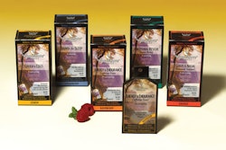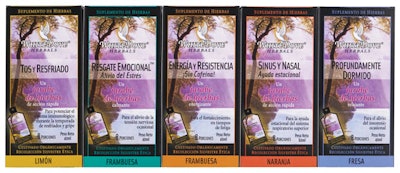
“Others have placed the English/Spanish on the front together, but this design has a nice flow to the box, and you can turn it for the specific market, whether Spanish or English,” notes WhiteDove coo Pete Hay. He says that the concept was designed in-house and carried out by Ascent Marketing, which also developed the matching packet graphics.
This approach enables WhiteDove to highlight the package artwork without the bilingual copy becoming cluttered, an aspect that’s especially appropriate for its products that are intended to have a healing or calming effect. “This allowed us to keep the artwork intact, but also get the information out that we wanted to,” Hay adds.
The bilingual packaging was crucial, according to Hay, because one of the products’ target customers is the Hispanic market. “They are much more amenable to using herbals because they’ve been using traditional and alternative medicines for a lot longer than we have,” he explains. “When we designed the bilingual packaging, we were thinking of the growing Hispanic and Latino population here in America, and many products include bilingual designs. We kind of catered to their preferences for herbs in the design.”
Currently, there is no bilingual copy on the packets, but that will change likely this summer when the 7.5-mL packets debut. Due to space limitations on the packets, the product name only will appear in Spanish on the reverse of the packet.
“By law, you have to have the Supplement Facts, and we want to keep the text big enough so people actually can read it,” explains Hay. “When copy gets too small, it almost looks like you’re hiding something. Plus the older you get, the harder it is to read.”
The company’s bottled versions had not been bilingual, due to lack of space. WhiteDove also plans to produce bilingual English/French cartons for the Canadian market at a later date, Hay notes.
To read the main story, see Predosed packets take herbals mainstream.
.