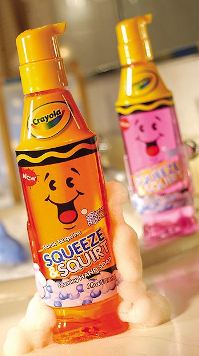
In creating the brand communication, Berlin Packaging’s Studio One Eleven design agency discovered that Crayola owned both the Squeeze & Squirt name and “Tip,” an animated character. But Tip seldom had been used.
Packaging design incorporates Tip into the bottle structure as well as the full-body PVC shrink-sleeve label. The 6-oz PET bottle is shaped like a crayon with a cylindrical body and tapered top. Tiny arms and feet are embossed into the mold of Tip’s “body.”
A squeeze foamer from Emsar crowns the container. It resembles the head of a crayon and supports the product’s namesake “squeeze-and-squirt” capability.
The dispenser allows kids to produce a foamy soap by squeezing the belly of the container rather than pumping from the top of the package. The bottle requires one-handed operation and the foamer contributes to the illusion of a crayon brought to life.—Jim George