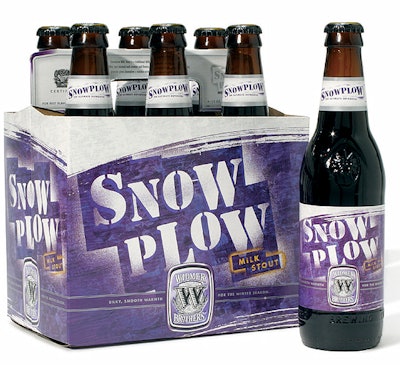
In addition to the new packaging and collateral design, HADW suggested renaming the beer SnowPlow, evoking a seasonal spin for the milk stout. Widmer Brothers was looking for packaging graphics that would enable its product to stand out within the saturated alcoholic beverage market. Focusing more on niche beers, designers chose to showcase SnowPlow’s individual flavor and its unique characteristics. The redesigned packaging is more textural and conceptual in design, enabling a stronger differentiation between the seasonal blend and its main core line. Rich use of color and simplified graphics give the beer a banner-like quality on the shelf.
Companies in this article