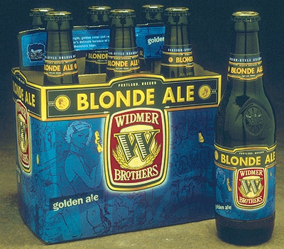
Originally labeled “Sweet Betty,” the golden ale was struggling with sales because many consumers tended to equate the name with a sweet-tasting beer. To reintroduce the product as a “Blonde Ale,” HADW designers created a fresher, more contemporary illustration style that retained equity within the master Widmer packaging graphic architecture. The new “personality” is a svelte and savvy woman, who appeals to both male and female consumers, more so than the 1940’s-era Betty of old. The color palette also changed from the old-fashioned sepia-tone to a rich blue hue to express a hip, bold attitude.
Companies in this article