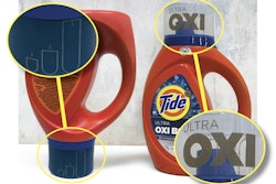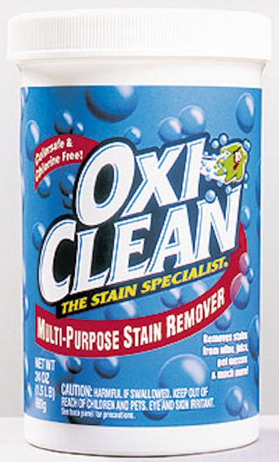
To maintain the brand’s success, attract new consumers, and more effectively accommodate line extensions, parent company Englewood, CO-based Orange Glo Intl. turned to Keck Garrett Associates (Chicago, IL) to revamp the old design. Over the past year, KGA determined the brand’s equities, and used OxiClean’s signature blue background and floating bubbles, simplifying the logotype. The changes made the brand name easier to read, and created a color-coding system so consumers could quickly find the OxiClean product variety they sought. To enhance the unique elements of the logo, “Mr. Goo,” a green illustrated character, was moved from the bottom edge of the package to the right edge of the new logo design. KGA added a descriptor flag, presented as a swoosh, that imbues the package with dynamic motion and reinforces the message of OxiClean as a powerful cleaner. The cumulative effect of the redesign resulted in less graphic clutter on the package.