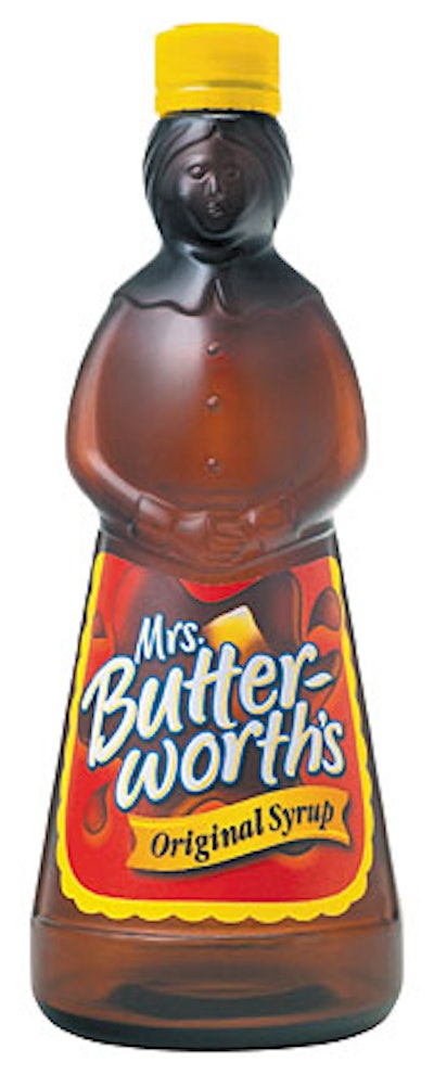
Butterworth’s products, namely pancake mixes. To bridge this recognition gap, St. Louis-based Aurora Foods turned to Enterprise IG (San Francisco, CA). To create a brandmark that not only builds off the brand’s rich 40-year heritage, but also supplies a more contemporary edge, Enterprise IG incorporated a splash of syrup with the Mrs. Butterworth’s name written over the top in a contemporary script. A melting pat of butter was added for taste and texture. The pressure-sensitive label is litho-printed in six colors.
Companies in this article