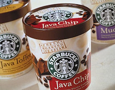
Designers at Enterprise IG utilized the distinctive Starbucks logo as the central focus of the package, while also using design elements to communicate specific product attributes. The logo was enlarged and highlighted by a light, cream-colored background. “Our strategic understanding of the problems involved with horizontal brand extensions gave us the tools to balance the brand strength of Starbucks with the visual qualities necessary to compete effectively in the super-premuim ice cream category,” a consultant at Enterprise IG says. At press time, printing specifications and distribution information were unknown.
Companies in this article