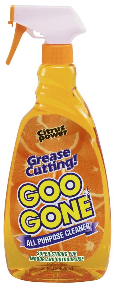
Bold graphics on the container-contact side of the back label is making Goo Gone All Purpose Cleaner a lot more noticeable on store shelves. Making the front label out of clear film also plays a key role.
“Using a clear front label allowed us to develop unique packaging that permits customers to view two design elements at the same time,” says Scott Zeilinger, vice president of Magic American Corp., the Cleveland-based firm that markets the product. The two design elements he refers to are the oranges printed on the back label and the brand name printed on the clear front label. The oranges reinforce the citrus-based origin of the product.
The Kennedy Group (Eastlake, OH) provides both front and back labels. The clear front label is a 2-mil biaxially oriented polypropylene, printed flexographically in seven colors.
The back label is the more complex of the two. A proprietary three-ply material, it has vibrant images of oranges printed flexo in six colors on one side and, on the other, product identification and suggestions for use. The orange-printed side adheres to the back panel of the clear bottle, so when the bottle is viewed from the front, the oranges are clearly visible through the liquid and through the clear front label. The side of the label with copy faces out from the back panel. Built into the center of the label, though Kennedy doesn’t say precisely how, is sufficient opacity so that the copy on the back doesn’t bleed through and spoil the oranges on the front. Similarly, the oranges don’t bleed through the copy.
Also new is the polyethylene terephthalate bottle, supplied by Kaufman Container (Cleveland, OH). It replaces a polyvinyl chloride bottle that was more prone to damage during shipping. A cost comparison of old vs new package was not available at press time.
In a hurry? Request more info via Web-based reader service by clicking on the reader service number.
Or you can jump right to their Web site.