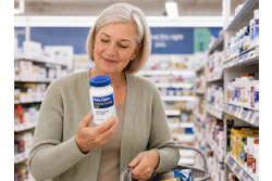
When Rob Johnson, CEO of Uncle Dougie’s joined the company in August 2017, he took an inventory of the package graphics for the company’s barbecue sauces and found there were some elements that had become more common in the category that Uncle Dougie’s was missing. One request from consumers was a clear indication on the label of the heat level of the sauce. This inspired the creation of Uncle Dougie’s Heat-O-Meter—a set of five flame icons, with the heat of the sauce indicated by the number of flames colored red versus white—which can now be found on all of its BBQ sauce packaging. The other, he says, was a description of the taste profile for each variety, an important addition as some of the flavors were not as “straight up the middle” as some of Uncle Dougie’s legacy sauces.
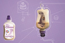
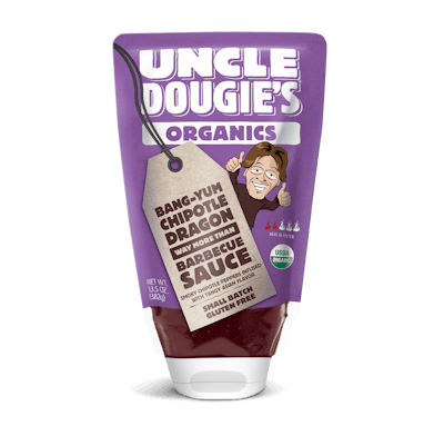
When it came to designing the graphics for the new Organics line in the STANDCAP pouch, the goal was to make them different enough from the jar labels so that they were clearly distinguishable, but similar enough that they provided a consistent brand identity. To accomplish this, Uncle Dougie’s worked with its longtime design partner, Schafer Condon Carter (SCC).
To differentiate the new Organics line from Uncle Dougie’s bottled offerings, SCC flipped the color scheme. Whereas the labels on the jars use a Kraft-colored background with a hang-tag illustration (a nod to its small-batch provenance) in a solid color, the Organics graphics comprise a bright, solid-colored background with a Kraft-colored hang tag. “It was just a way to unify the entire line around the same packaging graphics architecture, but differentiate the Organics line so when people saw it, they would know it was something a little bit different,” Johnson explains.
For the bottle label, the Uncle Dougie’s logo in brown is positioned vertically on the left side of the front panel. The pouch provides a bigger billboard, so the logo takes a prominent position at the top of the package and is printed in white. Underneath the logo is a solid-colored white bar within which is the Organics moniker in the same color as used for the pouch.
Just as with the bottled sauces, a cartoon illustration of founder Doug Tomek giving a thumbs-up sign peeks out from behind the hang tag on the Organics line. The hang tag itself uses a different design, but uses the same typography and provides the flavor names and descriptions, just like the hang tag on the bottle labels.
In terms of the background color for the Organics pouches, SCC and Uncle Dougie’s chose colors for each variety that would align with the different flavors, while still being mindful of Glenroy’s requirements, as well as the color’s compatibility with other graphic elements on the package. “For example, for our Hickory Bourbon, we originally wanted to have a reddish brown color just because of the color of the sauce,” says Johnson. “But it would have been impossible for us to get some of the other things on the package, such as the Heat-O-Meter, to stand out with that color.” Instead, Rich Hickory Bourbon uses a burnt orange color.
Of the final design, Johnson says he is “really happy with the way it turned out.” He adds, “I think one of the cool things is, like I said, our brand motto is ‘Good, Clean Fun,’ and I think the range of colors makes the product portfolio look really fun. When you’ve got the product on-shelf with all these bright colors, it’s just a really fun package.”
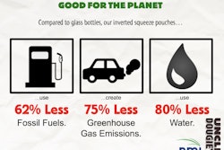
Read main article, "Inverted Pouch for BBW Sauce a First for the Category," here.