Disruption and simplicity are essential packaging tactics today.I’ve heard numerous presentations and talked with many innovation, brand, and design managers over the past few months at companies the likes of Dial, Nestlé, Wrigley, and Colgate-Palmolive. They all paint the same picture: There’s too much “stuff” in virtually every aisle of the store, and it’s the charge of marketing and design to do a better job with packaging to cut through the clutter.
William Lunderman, vice president of global strategic brand design at Colgate-Palmolive, summed up this call to action for brand owners as well as anyone I’ve heard this year when he said recently, “We have taught consumers to be intelligent. Let’s give them credit. Don’t overcommunicate with them.”
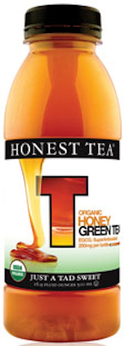
The labels on bottles of Honest Tea are a great example, reflecting the notion of simple communication and a clear and relevant message. They provide disruption in the crowded and visually “noisy” ready-to-drink tea aisle. The labels are visually “quiet” and communicate product authenticity as an organic beverage.
Bottled beverages, says Seth Goldman, Honest Tea Co. president, often lose consumer trust by overpromising about the product. Honest Tea Co., working with Moxie TM (www.moxie tm.com), calls attention to the authenticity of its Honest Tea’s USDA-Certified Organic ingredients. The label promotes the organic message.
“It starts with the product,” Goldman says. “It has to be what the package says it is.”
How does the message come through? The film label’s white background helps distinguish the brand from the sea of color across the category, notes Tammy Vaserstein, Moxie TM principal. White connotes freshness and simplicity, whereas too much color says “artificial” rather than “organic,” she adds.
The label’s black border visually anchors the product line. Simple typography matches the brand’s promise, and luscious fruit illustrations, each with a “T” graphic, add to the fresh organic appeal, identify each flavor variety, and contrast the white background. A sliding-bar graphic indicates how much epigallocatechin gallate (EGCG), an antioxidant in tea, is contained in each bottle.