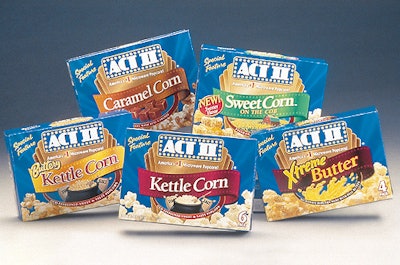
They added gradation to the film ribbon that runs across each pack’s front. Designers also softened the marquee lights in the background, which sets off the ACT II name. A small sparkle was added to the film ribbon. For the second, more premium tier, designers changed the backdrop color from blue to gold. They also changed the shape of the film ribbon. An oval shape was inserted under the film ribbon with illustrations that represent each flavor’s unique characteristic. “They were able to take what basically looked and felt like a packaging mosaic at the shelf level and bring a real sense of identity to it,” says Dan O’Conner, director of marketing for ACT II. “Not only that, they took the design a step further and gave the packaging a higher quality line look within the brand.”