The changes encompass virtually all stockkeeping units of the two brands, including single servings, king-size and value packs, as well as packaging for club stores, concessions, and fundraising.
"We would never change the Reese’s orange background, because that’s key and most everybody associates the color with Reese’s," says Judy Hogarth, a spokesperson for the Hershey, PA, candy giant. "But this is a fresh, new, updated look. We did consumer focus group testing and consumers reacted positively to the distinctive design and more contemporary appearance."
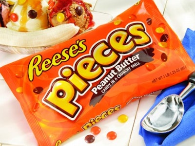
The new swirling textural element is the most recognizable graphics change, along with bolder lettering, which is particularly evident with the Reese’s Pieces wrapper. "The swirls in the orange background help communicate the creamy peanut butter," adds Hogarth.
To create the new "brand expression," Hershey’s partnered with design consultancy Libby Perszyk Kathman (Cincinnati, OH). Printpack (Atlanta, GA) prints wrappers for the two-cup packages. Four-color flexo printing is used for the two-pack of cups. Its film structure includes 60-ga biaxially oriented polypropylene/ink/adhesive/1.22-mil cavitated BOPP. For Reese’s Pieces, Printpack prints the wrappers gravure in seven colors. Its structure is 79-ga coextruded BOPP/ink/adhesive/79-ga coex BOPP.
"This revitalized brand identity keeps us relevant in a climate of changing consumer expectations," says Andy England, director of marketing for the Reese’s franchise. "It is critical that we continue to build equity in every expression of the Reese’s brand."—JB
