In the realm of packaging design, several common strategies span various categories. Yet, within individual markets, distinct tactics are utilized, influenced by an array of factors like the product, consumer expectations for the category, and the competitive environment. The packaging of alcoholic beverages, particularly spirits, is especially dependent on package design to convey quality
In several articles on his company’s website, Kevin Smith, founding partner of CPG brand development agency SmashBrand, points to how the competitiveness of the premium liquor market has impacted packaging design in the category. “A premium spirits packaging design once assumed premium authority with custom glass bottles and unique corks,” he writes. “Now, custom packaging requires the smallest, most intricate details, along with the right label design to catch the consumer’s eye.”
In addressing current trends in spirits packaging design, Smith notes that storytelling continues to be a driving factor. “There’s an element of history poured from custom glass packaging into the glass of the customer,” he says.
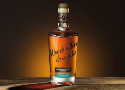
In creating the package design for its limited-edition Woodcutter’s Daughter Rye Whiskey, Silent Pool Distillers employed both elegant design details and storytelling to produce a sophisticated and evocative bottle design. Silent Pool worked with brand design and innovation agency Seymourpowell, directing them to “purposely ‘go against the grain’ and challenge the visual language of the category,” according to the design firm.
 | Read related article, “Spirits Bottle for Veteran-Owned Whiskey Brand Hits its Target.” |
The legend behind the product’s name is born from the original Silent Pool tale of a young maiden, the woodcutter’s daughter, who met her untimely death upon drowning. Shares Seymourpowell, the design was inspired in equal part by the essence of the idyllic English Surrey Hills landscape and the metropolitan dynamism of New York, reflecting the product’s uncommon blend of British and American whiskey.
“The design is a modern and bold reinterpretation of traditional whiskey cues, to attract a new audience looking for an accessible route into whiskey,” Seymourpowell explains. “The base label nods to these old traditions in its familiar embellishments and typographic language, while contemporizing through a modern choice for the variant color palette. The gestural and dynamic WD word mark conveys the confident attitude of the brand.”
The Woodcutter’s Daughter character is immortalized through the crafting detail within the typographic treatment of the WD brand mark. Her profile is celebrated within a distinctive “S” character shape. This iconic detail reappears on top of the closure and features as a focal point on the neck label.
Weaving around the silhouette on the neck label are stylized illustrations of the native flora and fauna that surround the Silent Pool. These are depicted in warm copper tones, embellished with hot foil stamping. This ethereal location also inspired the batch name for the first whiskey, Speckled Wood.
 Scotland’s best known vodka brand, Glen’s, worked with creative agency Thirst on a redesign of its packaging that leans into the brand’s roots while giving it new relevance.
According to Thirst Creative Director Matt Burns, the agency’s primary challenge was to overcome the brand’s drifting sense of identity. “For over 20 years Glen’s has been part of the fabric of Scottish culture, synonymous with so much of what the nation is famous for—its sense of wit and fun. Yet with ongoing fragmentation and a drifting sense of identity affecting quality perception and impeding growth, it was time to reassess the brand direction.
“We wanted to move it away from emulating inauthentic provenance and instead take pride and confidence in its own roots, at the same time retaining its distinct demeanor and straightforward quality that appeal to smart, value-seeking consumers and bring a refreshing lift to the category.”
| | Read how spirits brand Beg Distiliaria designed a refill system for its premium artisanal gin. |
Thirst’s rich visual contemporary reimagining of Glen’s Vodka is based in its heritage. A red, white, and gold palette remain, as do lions on the brandmark, but they have been recrafted to amplify the brand’s reliable taste experience, along with a simplified monogram and the addition of a quality panel, which together add authenticity and origin to the product story.
Refreshed and modern typography against the core palette of red and white underpin provenance, process, and experience as the basis for Glen’s off-pack brand and product messaging—“Proudly Original,” “Extra Smooth,” “Triple Distilled,” and “Produced and Bottled in Scotland.”
Concludes Burns, “With a fresh new story to tell and visual equities to convey it, this fresher, more modern Glen’s stakes its claim to everyday quality, and paves the way for the brand’s braver growth ambitions.”