Katonah, N.Y.-based medical and recreational marijuana company Etain was founded in 2015 by Amy Peckham and her daughters, Hillary and Keeley, after they watched their “Granny Franny”—Amy Peckham’s mother, the late Frances Keefe—battle with and seek treatments for ALS. It was this experience that brought home to them the importance of accessible, high-quality medical marijuana in their home state and propelled them in their quest to make a difference in people’s lives through premium cannabis products.
Etain’s first offering was a line of healing tinctures, which it sold at its first two medical marijuana dispensaries, located in Albany and Kingston, N.Y. Today the company offers a comprehensive product range, including capsules, flower, lotion, powder, lozenges, sprays, and a vaporizer, from its five dispensaries located across the state. Depending on the CBD-to-THC level of a product, it falls under one of four lines: Dolce, Mezzo, Balance, or Forte. Based on tempos in the music world, the strains produce a calming effect, a bounce of energy, increased energy and mental stimulation, or strong euphoria and cognitive stimulation, respectively.
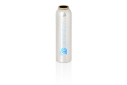
In its early days, Etain was more focused on getting product on shelf and keeping its stores open than on developing its branding and packaging, both of which were simple and utilitarian. Primary containers consisted mainly of standard plastic medicine bottles in blue, red, and green labeled with stickers, while packaging for vape pens, lotions, and sprays was generic and mostly made of plastic. There was no secondary packaging.
 | Watch “Cannabis Comes of Age—Video Report and Interview.” |
In fall 2019, with the legalization of recreational cannabis on the horizon in New York, Etain reached out to global brand consultancy and creative agency 50,000feet to rebrand its packaging and give the company a fresh look for market entry.
Of Etain’s requirements for the new design, Nette Gaastra, Creative Director at 50,000feet, says, “On a higher level, the packaging had to strike a balance between the clinical and wellness aspects of the brand to convey the company’s story of whole health and self-care. On a more practical level, it had to convey the premium quality of their products—and price—and communicate a clear differentiation of the various product lines.” She adds that the packaging also had to use as little plastic as possible.
The resulting design is clean and minimalist, which Gaastra says is a reflection of the founders’ strong personal preferences and Etain’s clinical background, and the need to convey the company’s premium-quality product, in particular its multi-filtrated cannabis oil. “It underscores the pillars of their brand promise which are simplicity—Etain’s products are simple and easy to understand—and trust—Etain has a legacy of transparency around quality, safety, and ingredients,” she explains.

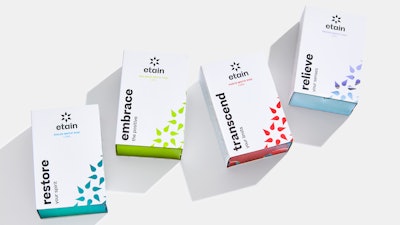
Adding personality and depth to the system is the use of vividly colored, immersive macro-photography of the high-quality cannabis oils used in Etain’s products. The photography shows up within each droplet, or petal, of the repeating logo-mark pattern. It’s also printed throughout the inside of the carton to provide an element of surprise.
Of the new typography and logo wordmark, Gaastra says “it’s modern yet friendly, bold yet approachable, just like Etain.”
Lastly, in addition to the names of the product lines, each carton carries a statement starting with a big verb—restore, transcend, embrace, or relieve—to underscore the benefits of the different formulations. Another small, inspiring product statement can be found upon opening the carton, playing up the brand’s tagline, “Take a Moment with Etain.”
 Adding personality and depth to the system is the use of vividly colored, immersive macro-photography of the high-quality cannabis oils used in Etain’s products.
Packaging is litho-printed in four colors plus one key Pantone color for each product line, and from bottle to box, it’s coated with a matte finish that unifies the materials. A subtle, black foil adds depth to the logo and the black type used on the carton while adding to the textural experience.
The new packaging was partially revealed at the end of 2020, with a bigger reveal in spring and summer 2021. The project initially encompassed 35 SKUs; 15 more were added within the year.
 | Read this story on “3 Examples of Cannabis Packaging in 2022.” |