A change in its product ingredients to become fully plant-based prompts craft chocolate maker TCHO to reinvent its packaging for consumer ease of use and greater storytelling.
On the front panel of the chocolate bar carton, Super Okay chose bold, bright color backgrounds that reflect the natural brilliance of cacao pods throughout the world.
For craft chocolate maker TCHO (“cho”), a radical transformation of its products required an equally dramatic change to its packaging. Since 2007, the Berkeley, Calif., company has been committed to crafting sustainably made chocolate bars and professional baking products through its TCHO Source sourcing program, whereby it partners with cacao farmers and scientists around the world to create a better cacao bean. Last year, the company achieved Certified B Corp status as a result of its work to improve the lives of its workers, customers, suppliers, and the local community.
In 2020, in an effort to create chocolate that further reflected its values, TCHO began the process of reformulating its products to be completely plant based. “Reducing our reliance on dairy is one of the quickest ways TCHO can lighten our impact on the environment. While this will not be an easy transition for us, we know it’s the right one,” shares Josh Mohr, Vice President of Marketing at TCHO. “From the beginning, TCHO has been committed to working with our farming partners in the field, improving farming techniques, bettering soil conditions, and doing what we can to help minimize deforestation—all of which speaks to a plant-based model.”
The reformulation includes a simplification of the ingredient panel on all of TCHO’s dark chocolate bars and a move to sunflower lecithin from soy. For its milk chocolate bars, the company has replaced animal milk with oats, cashews, and coconut sugar. This now means that the entire TCHO retail line is Certified Fair Trade, Certified Organic, vegan, gluten free, and kosher, and is 100% made fromplants. The new selection includes four delectable dark chocolate varieties and three milk chocolate selections in unique flavors such as Choco Latté, Born Fruity, and Holy Fudge.
In early 2020, TCHO approached brand design firm Super Okay to help them create a completely new brand platform to communicate the changes to its bars and tell the story of its mission. Says Mohr, “We knew we wanted to break through the sea of sameness on the craft chocolate shelf. TCHO originally launched as a very design-forward brand in the late 2000s, and we wanted to get back to that simplicity. We also asked Super Okay to bring our personality to the forefront, captivating the consumer enough to stop and grab one to read the back of the package while in the aisle.”
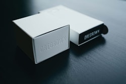
TCHO's chocolate bar packaging BEFORE the redesign.Structurally, the existing chocolate bar packaging consisted of a foil wrapper and a paper envelope overwrap, which held a nine-square, 70-g bar. The transformation includes a switch to three individually wrapped, 0.83-oz, three-square bars packaged in a square, wallet-style carton that not only enables consumers to easily share and store the chocolate, but also provides an “immersive experience,” as well.
Explains Robert Medkeff, Creative Director & Partner at Super Okay, “The packaging structure was a joint collaboration between TCHO and Super Okay. The concept was to use color and messaging as the main communicator on the outside. Upon opening the product, we wanted to provide a more immersive experience with a contrasting image linked directly to the bar itself, with a short writeup of the origin and/or flavor. This direction added an element of surprise and delight that aligns with the brand’s principles.”
TCHO's chocolate bar packaging AFTER the redesign.On the front panel of the carton, rather than having an ingredient or a background pattern taking center stage, as was done on the previous package, Super Okay uses bold, bright color backgrounds that reflect the natural brilliance of cacao pods throughout the world. The chocolate bar variety name is front and center in an off-white color, along with smaller copy in black that describes the bar and its ingredients. The copy uses a custom-drawn typeface that highlights the notion of craft and celebrates the legacy of wood type. “Its asymmetrical letterforms and whimsical cuts and curves provide rhythmic visual cues to entice chocolate lovers,” says Medkeff. “The art direction is elegant and simple, championing only the very ingredients of each bar.”
While the logo, which appears at the top of the carton on the front panel, is the only element of the previous design that was retained, it has evolved into a more “colorful and controlled visual system,” Medkeff explains. “We brightened the intensity of the orange [TCHO’s brand color] and boxed in the TCHO logo. This was an intentional decision. Since pivoting the brand to become extremely color forward, we wanted to find a way to ensure the consistency of the logo across all packaging and communications, regardless of other colors.”
Each bar has an image inside the carton that corresponds to whether it is origin forward or flavor forward, as is the case with the Dark Duo variety.Part of Super Okay’s design approach was to select images for the inside of each carton based on whether a bar was flavor-forward or origin forward. According to Medkeff, the individual images act as a visual cue to guide the consumer and help draw them further into the story behind each bar. “With Holy Fudge, for example, the image is one we shot in Ghana with a farming partner of TCHO’s. We wanted the consumer to see the environment where the cacao beans were being grown in a very honest and authentic way,” he says. “By contrast, Toffee Time has beautiful macro photography, showcasing the raw ingredients that make up the flavor of the bar.”
Along with copy that details the background of the bar, the inside of each carton is printed with a QR code with the words, “Learn Where This Cacao Was Grown.” By using their smartphone, consumers can access a page that provides tracking information for the cacao from each bar. Explains Mohr, “We wanted to be as transparent as possible, and since the pandemic made QR codes more popular, we figured we’d provide people who purchase our bars direct access to the Google sheets we use to manage the cacao we purchase.”
Another design element of note is one that harkens back to the chocolatier’s beginning. “The original TCHO packaging was clad with a gold foil pattern that had got lost over the years as the brand evolved,” explains Medkeff. “The pattern represented the history of chocolate’s early days as currency in Central and South America. The subtle touch is something we wanted to bring back with the new branding.” The spirograph pattern first used by TCHO is now a concentric square pattern that is used on both the primary wrappers and the bars themselves and reinforces the company’s new strategic positioning, which is “Chocolate. Fair & Square.”
Lastly, TCHO also made sure its packaging reflected its sustainability values by using more eco-friendly packaging. The wrapper for the bar is a multilayer construction of 100% recycled-content paper and compostable, non-GMO polylactic acid (PLA). The carton is recyclable paperboard.
The new line of chocolate bars launched in early December 2021 exclusively on TCHO’s website and will be rolled out to retail distributors and accounts in spring 2022.
Robots that see variations, adjust grip pressure automatically, accept plain-English commands, and predict their own maintenance. Discover how AI is transforming packaging operations.
Looking for engineering services? Our curated list features 100+ companies specializing in civil, process, structural, and electrical engineering. Many also offer construction, design, and architecture services. Download to access company names, markets served, key services, contact information, and more!


 TCHO's chocolate bar packaging BEFORE the redesign.