The inspiration behind the branding for new Sundays air-dried dog food has several layers, as does the packaging structure itself. In particular, say co-founders of the direct-to-consumer company Sundays Food for Dogs, Inc. Michael Waxman and veterinarian Dr. Tory Waxman, “Sundays are usually a day where pet parents can spend a relaxing day at home with their dogs, and we want every day to feel like that. Additionally, the food is designed to be served with the same ease of pouring a bowl of cereal, which we say is ‘easy like a Sunday morning.’”
See: First Pet Food Brand Joins Loop
The start-up company began as many new better-for-you emerging brands have, by creating their own product after failing to find one among the preservative-laden products dominating the market. As the Waxmans relate, when their dog Mabel got sick, they “became obsessed with finding the best dog food: something healthier than kibble, but easier than home-cooked foods.” They add, “When we couldn’t find it, we made it.
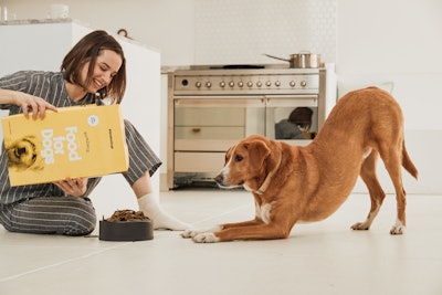
 The ready-to-eat food is sold in three box sizes—40, 72, and 144 oz—decorated in a sunny yellow with a photo of the Waxmans' dog Mabel.
The concept for the box, Michael Waxman adds, “has a few layers to it.” He explains, “The main inspiration is that since our customers treat their dogs like family members, we thought the cereal box was a fun wink to the nostalgia of what we ate as kids. Another reason is that all of our food is going into shipping boxes anyway, so a box shape helps to protect the food and ship it more efficiently.”
The choice of a bright yellow background was driven by a fun bit of trivia known to Dr. Waxman. “Dogs are partially color blind; they can only see on the blue-yellow spectrum, which means they can only really see yellows, blues, and greys,” she says. “It made yellow an obvious choice for our primary brand color, since dogs can see it, and it underscores the ‘sun’ part of the word ‘Sundays.’”
See: Global Pet Food Market Surpassed $94.6 billion in 2019
Sundays partnered with branding agency Bondfire to develop their brand strategy, naming, and identity system. Packaging graphics include the Sundays wordmark designed with a subtle arc, which references the sun, a dog bowl, and even a dog collar. Because the cereal boxes themselves are nostalgic Dr. Waxman says Bondfire and Sundays leaned into that. “The greyscale dog image is an homage to classic cereal box designs, particularly Wheaties,” she says. “Word games on the back are also references to 20th century kids’ cereals."
 Word games on the back of the boxes are references to 20th century kids’ cereals.
Sunday dog food in a beef variety is available through the company’s website and is sold D2C as single orders or by subscription, shipped in a roll-end front-tuck corrugated box. The Waxmans say they will be releasing a chicken variety soon and have plans to sell offline—a strategy that was delayed from 2020 to 2021 due to the pandemic.