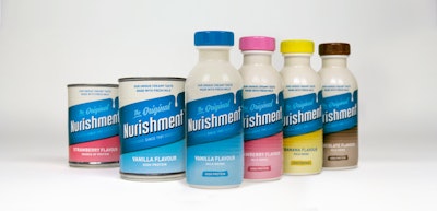
Contemporary new graphics that focus on the unique taste of milk-based nutrition brand Nurishment along with a new bottle format are designed to appeal to larger consumer base.
Contemporary new graphics that focus on the unique taste of milk-based nutrition brand Nurishment along with a new bottle format are designed to appeal to larger consumer base.
U.K.-based functional drinks company Nurishment has unveiled a modern and more approachable identity for its product, one of the country’s most popular cult drinks. The redesign affects classic tin can units of the fortified milk-based drink and includes a new set of bottle designs to target consumers who may previously have found the can format a barrier.
Carrying out the rebrand, strategic design and innovation agency Seymourpowell looked to make subtle changes to the image of the product, shifting older rhetoric that focused on the nutritional benefits of the drink in favor of its taste, something wholly unique to Nurishment as a brand. It was also critical to maintain familiarity with loyal heritage customers to avoid alienating the core communities that have enjoyed the Nurishment product and made it an enduring brand for 40 years.
Read related articles on the redesign of iconic CPG brand packaging from Packaging World:
The Seymourpowell team began by decluttering the original design, reducing a lozenge angle for better legibility, enriching the blue brand colors for greater shelf blocking, and simplifying copy pertaining to the drink’s nutritional qualities. In addition, the integrated cream at the top of the pack and the creation of an ownable “drip” within the brand lozenge reinforce Nurishment’s unique and deliciously fresh and creamy milk taste credentials.
Nurishment BEFORE (l.) and AFTER the redesignSays Dave Ralph, Senior Design Strategist at Seymourpowell, “Our strategy here was to simplify and modernize the nostalgic visual elements that have made Nurishment so endeared by our hard-working communities in the U.K. since its inception. We have been very careful in maintaining what makes this brand special for so many, but also felt that the emphasis should be placed on the product’s true unique quality: its taste. As such, the subtle changes we have made are to reposition the brand as something everyone can enjoy, not just with those that are already familiar with it and understand that neighborhoods thrive when they are nourished.”
As well as recrafting the identity found on the iconic tin can, Seymourpowell created a new, easy-drinking, convenience bottle design with the intention of being ownable, confident, and scalable. Aligning the structure with the bold simplicity of the iconic tin can ensured the new design was recognizable to core consumers, while the softer silhouette and practical format is more approachable to newer consumers. Says Seymourpowell, presenting the authentic forms of a traditional milk churn further reinforces the great taste, strong heritage, and fresh milk credentials of the drink.
Says Bola Akintewe, Beverages Brand Manager for Nurishment parent company Grace Foods UK,“Seymourpowell helped us define the brand’s essence and the potential path to growth in a clear and easy to apply brand strategy. The team also did a great job in translating the brand’s new direction into its new label design in-line with consumers’ feedback and in creating a unique bottle design as part of our NPD. They were true partners in seeing the changes brought to life, including working with our technical teams and supply chain to ensure feasibility of the designs and formats.”
PACK EXPO Connects
Join us for “The Most Engaging Virtual Event for the Entire Industry” at PACK EXPO Connects, November 9-13. Live demos of equipment and products, live chat with product experts, expedited product search, and more. Attendee registration opens September 15. Be notified when the site goes live by clicking here.
Editors report on distinguishing characteristics that define each new product and collected video demonstrating the equipment or materials as displayed at the show. This topical report, winnowed from nearly 300 PACK EXPO collective booth visits, represents a categorized, organized account of individual items that were selected based on whether they were deemed to be both new, and truly innovative, based on decades of combined editorial experience in experiencing and evaluating PACK EXPO products.
Break out of the ordinary: see what’s new in packaging & processing!
At PACK EXPO Las Vegas, you’ll see machinery in action and new tech from 2,300 suppliers, collaborate with experts and explore transformative solutions. Join us this September to experience a breakthrough in packaging and processing.