He defined it as “the design of all products and environments to be usable by people to the greatest extent possible without the need for adaptation or specialized design.” Mace’s philosophy challenged the conventional approach to design and made for a more inclusive world.
Seven principles guide the UD philosophy, each with its own design guidelines, to achieve and evaluate inclusiveness. The concept and principles of UD have been traditionally applied to architecture, product design, and Web-page design. They can also work wonderfully in package design, yet they have yet to be widely embraced by the packaging industry.
This article adapts the seven principles of UD to package design in order to demonstrate the promise that this philosophy holds for consumer packaged goods. Package designs that implement UD can provide superior response to consumer needs by considering users with a variety of capabilities. Follow them and you may increase sales for your brand.
Principle One: Strive for equitable use of the package.
The first principal aims to ensure that a variety of consumers can use the package, regardless of differences in their physical abilities, behaviors, habits, and size. Kimberly-Clark’s redesign of Huggies Baby Wash packaging is a great example. Kimberly Clark realized during its ethnographic research that many mothers have only one hand available to manipulate the package while bathing a baby because the other hand remains on the baby at all times. This challenge made the old package difficult to use.
The redesigned package is a “grippable” bottle with a large lid that mom can manipulate with either one or two hands. The new package is equitable for the consumer, regardless of her behavior or ability.
Design guidelines:
*Provide the same means of use for all users of the product—identical use whenever possible, equivalent when not possible.
*Avoid segregating or stigmatizing any consumers.
*Make provisions for privacy, security, and safety equally available to all consumers.
*Make the design appealing to all consumers.
Principle Two: Provide flexibility in use.
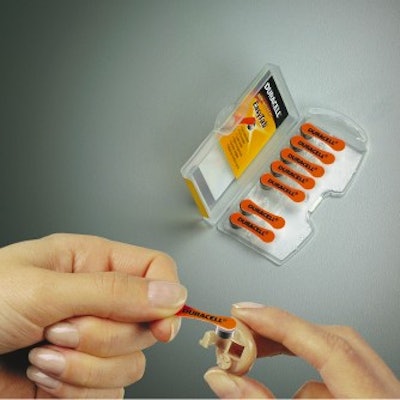
Among other things, principle two encourages designs that facilitate a consumer’s accuracy and precision. A redesign of Duracell’s hearing aid battery packs, a joint undertaking between Duracell and Product Ventures, underscores this idea.
The original package design contained the product, a very small hearing aid, and was comparable to competitors’ package designs. However, research showed that consumers found it difficult to place a battery into a hearing aid correctly. Many consumers elected to wait for help with battery changes and frequently saved their hearing aids for “special occasions.”
The solution to this problem took the form of the Duracell EasyTab. The redesigned package serves as a tool for placing the battery into the hearing aid while also enhancing the accuracy and precision of product-user movements and eliminating the likelihood that the consumer will place the battery upside down into the hearing aid.
Design guidelines:
*Provide choice in methods of use.
*Accommodate right- or left-handed access and use.
*Facilitate the consumer’s accuracy and precision.
*Adapt to the consumer’s pace.
Principle Three: Design for simple and intuitive use.
Following this principle, it is possible to examine a package to determine whether it is as simple and straightforward as it can be to use. Your design is successful if an untrained person can effectively navigate the design and understand the product immediately. Use of the package and product should be easy to understand, regardless of the consumer’s level of experience, knowledge, language skills, or current concentration level.
Procter & Gamble’s Febreze Air Effects air freshener provides a good example of how shape, configuration, and color help to communicate function. The can’s trigger and grip zone guide the consumer to the appropriate grip and suggest the direction of use. Good design alleviates the likelihood of error, which is possible with traditional aerosol cans.
Design guidelines:
*Eliminate unnecessary complexity.
*Foster consistency with user expectations and intuition.
*Accommodate a wide range of literacy and language skills.
*Arrange information so it is consistent with its importance.
*Provide effective prompting and feedback during and after use.
Principle Four: Communicate perceptible information.
This principle really means, “Am I clear?” This is typically, although not necessarily, accomplished by using visual messages. Packages that poorly execute this principle include designs with exceedingly small print, cluttered labels, and poor contrast.
Poor execution can go beyond printed labels. Consider the snap cap, a child-resistant closure that requires a consumer to line up two arrows, one on the cap and the other on the bottle. Even though the arrows are generally embossed, insufficient contrast between the arrow and the cap or bottle can make the processes of lining up the arrows difficult. The problem becomes magnified among older consumers with diminished contrast sensitivity.
Design guidelines:
*Insert different modes (symbol, text, tactile, etc.) for redundant presentation of essential information.
*Maximize the legibility of essential information.
*Differentiate elements in ways that can be described.
Provide compatibility with a variety of techniques or devices.
Principle Five: Provide tolerance for error.
Consumers make mistakes when using things, and packaging is no exception. Since these behaviors are unpreventable, package designs should “tolerate” them without causing damage to the product or injury to the consumer.
The Duracell case study, presented in Principle Two, demonstrates how good package design can provide features that alleviate user error. Many Duracell consumers placed their hearing-aid batteries into the hearing aid upside down when using the product’s previous package design. The new design adds a simple handle to the battery and provides a tool that facilitates the precise and correct placement of the battery into the hearing aid, eliminating the potential for human error.
Design guidelines:
*Arrange elements to minimize hazards and errors.
*Provide warnings of hazards and errors.
*Provide fail-safe features.
*Discourage unconscious action in tasks that require vigilance.
Principle Six: Minimize the physical effort.
Ideally, packages should work well when consumers exert minimal physical effort. The designs should consider users who may be weak, tired, or weakened from medical conditions. One such condition is arthritis, the most common cause of disability in the United States. It affects about one in three adults, and 63% of consumers 65 and older.
A common challenge facing arthritis patients is the amount of force required to open some closures, particularly those that are child-resistant. McNeil Consumer Specialty Products, the manufacturer of Tylenol, recently received praise from the Arthritis Foundation for a push-and-turn closure that considers consumers afflicted by arthritis. Comments from Foundation tests include, “very easy to open,” “easy to grip,” and “cap size is good for arthritic hands.”
Design guidelines:
*Allow the consumer to maintain a neutral body position.
*Use reasonable operating forces.
*Minimize repetitive actions.
*Minimize sustained physical effort.
Principle Seven: Select the right size space for approach and use.
The shape and size of a package, or its components, have profound consequences on a product’s usability. Appropriate size and space should be provided for approach, reach, manipulation, and use, regardless of the consumer’s body size, posture, or mobility.
An example of this principle is a club-size (2.1 liter) Listerine bottle created by Pfizer and Metaphase Design Group. The bottle’s grip fits a variety of hands, making the bottle easier to lift and pour. These benefits translate into an advantage not only for the consumer, but for store associates as they stock shelves.
Design guidelines:
*Provide a clear line of sight to important elements for any seated or standing user of the product.
*Ensure that the reach to all of the packaging components is comfortable for any seated or standing user of the product.
*Accommodate variations in hand and grip size.
*Provide adequate space for using assistive devices or personal assistance.
Javier de la Fuente is a Research Assistant at Michigan State University’s School of Packaging, where he is pursuing his Master of Science degree. His research focuses on applying the concept of universal design to package development. Laura Bix is an Assistant Professor at MSU’s School of Packaging. In addition to teaching classes and conducting research, she leads a team that has conceived, designed, and conducted “universal package” seminars, which introduce universal design principles to the packaging industry. Contact Bix at 517/355-4556 or [email protected].
Click here to see the sidebar to this story: Conference to explore universal design and packaging.