I somehow gravitate to the simpler, less busy, more sophisticated packages where the underlying tone is “less is more.”
Wandering through Wal-Mart’s aisles the other day, I was oversaturated with visual pollution. So many brands are stacked next to and on top of one and other, all trying to shout out, “I am different! I am new! I am better value that the one next to me!”
It suddenly hit me that if I am reaching saturation level—as a design professional—how must consumers feel? Hence, I borrow architect Mies Van Der Rohe’s “less is more” principal. Hence, I recommend that my clients “break through the noise with quiet.” Simply, keep it simple and sophisticated.
First of all, what is sophistication? The term has a certain “je ne sais quoi,” poorly translated to mean “I don’t know what it is that is so special about that but something definitely is.” It’s about creating an allure that might not be visible immediately, perhaps it’s slightly hidden behind layers. It’s a design whose intrigue invites the consumer to peruse, try, and hopefully appreciate. Good examples of this thinking are the Qiora health and beauty products.
Sophistication is about attention to detail. Not only do all the components work faultlessly, but there is also a place for every detail and every detail is in its place. Sophisticated packaging stands out. Cosmetic lines like Shiseido create a very distinct and consistent family appearance. Each mascara, lipstick, and compact is precisely engineered and designed to communicate and deliver something different from the other.
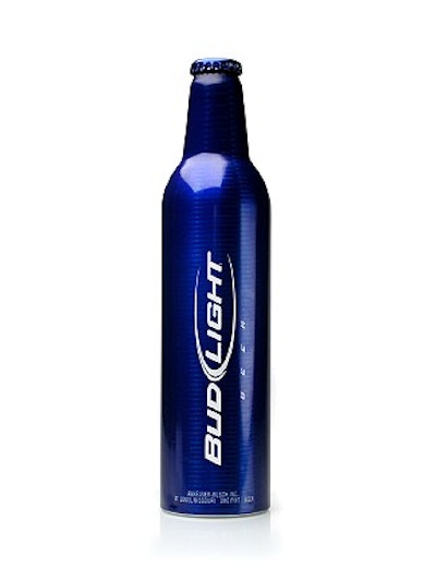
Sophistication has an appropriate elegance and a refined simplicity. It is both classic and contemporary; it is layered with depth of textures, translucencies, and tactility. It is something special without necessarily costing the world. In my opinion, sophistication is not exclusive to premium brands. Bud Light’s aluminum bottle is a great example of a brand that takes the higher road of subtle sophistication:
Why rant and rave about sophistication? Because I think today’s consumer is different from the one we were catering to in the previous century. Today’s consumer is much more informed, far less loyal, far more picky and fickle, and loaded with high expectations of how their brand should perform.
Loyalty is won by an emotional engagement with the consumer. Our new discerning consumer has a plethora of choices and is overwhelmed by a visual noise when shopping for the products she/he needs. This is where a more sophisticated approach—breaking through the noise with quiet—can actually help differentiate your brand.
Gillette Co.’s Venus female razor system has more than 40 different features and points of difference, from a handle designed for 25 different grips or shaving configurations to a razor head with special lubricated blades for improved gliding to the rechargeable razors being individually sealed for improved, albeit perceived, hygiene. It is a copywriter’s field day and a designer’s nightmare.
Still, you don’t learn much about those benefits from observing the front of the pack. Its swirls and beautifully flowing brand mark only slightly obscure the razor, the product hero. Gillette’s main purpose with the Venus line was to cement an emotional connection with its target consumer and, in this category, it meant downplaying those features and benefits in favor of enticing the consumer to identify the brand with a distinct appearance that gave Venus room to breath and bond with the emotively acute consumer.
Consumers will try and if your product exceeds their expectations, which Gillette Venus most definitely does, their loyalty is won and in turn this loyalty turns into an emotional decision and experience. Consumers love buying features, benefits, and good value, but they don’t need these benefits shouted at them. Packaging graphics must play a supporting role, building brand values and brand equities and inferring the product benefits from the reputation that is carrying them.
So as a packaging designer, I subscribe to this code of quiet simplicity because we can’t keep adding icons and violators on the pack to pretend to be better than the next. I have to try and convince my clients that less is more, and as long as the product does what it claims, the rest is all about building a bridge between the brand and the consumer’s heart.
Having plied my trade in London before coming to the United States, I often rely on my European cache to help with this argument, yet more and more I am able to pull very sophisticated North American brands as examples to build my case. That said, it’s not my European influence that is breaking the sophistication trend. The migration of sophistication was already well in advance before I set foot on U.S. soil in 1998. I have seen a lot of American laundry, hair care, personal care, even food brands borrow and steal from their European counterparts.
Even store brands like Boots and Marks & Spencer have created an allure with simple, sophisticated typography, placed in spacious white space, allowing the brand to breathe and express itself without nearby violators or background noise. Target and its Archer Farms brand are not far behind.
What is sophistication’s future in packaging? Designers (and marketers) have a fantastic toolbox at their fingertips, and everyday the bar gets raised by companies like Procter & Gamble, adorning and building their brands with tactics like:
• Unique bottle shapes and harmonized graphics
• Full-body shrink labels or clear, pressure-sensitive labels.
• Custom closures, pumps, and dispensers.
• Compelling secondary packaging.
• Foil blocking, metallic inks, and decorative applications.
This list is by no means comprehensive, which is why I would like to conclude with a tone of caution. We have to use these tools wisely. We have to be selective. We have to ensure we don’t over-commoditize sophistication. But any package design that plays well to the message of sophisticated brand should reflect the following three ideas.
1. Use your packaging capabilities strategically, especially where it concerns an extended brand portfolio (like Olay) or an extended portfolio of brands (like Anheuser Busch). Sprinkle those capabilities where they are most appropriate and relevant, and be strategic about your choices. I like how, for instance Anheuser Busch used pressure sensitive labeling on some of their lines, notably Bacardi Silver and Budweiser Select, shrink sleeves on their new BE drink and conventional paper labels on their core products. Olay Regenerist has unique secondary packaging that helps set it apart from Age Defying and Total Effects, sold in-store in very close proximity to Regenerist.
2. Give your brand some breathing room. Sometimes, your brand mark doesn’t need to be stretched to the limits of the billboard. Sometimes, the white space around the brand improves the focus the consumer needs to spend on other elements of the brand communication. It’s a welcoming trend to see even the staple brands like Tide and Downy Simple Pleasures adopt this more mature stance. There are several benefits. First, I think it allows the bottle shape to help communicate the proposition. Second, it helps the rest of the label to link some of the more emotive cues. Third, reducing your brand prominence actually strengthens your brand. Your consumer should remember and recognize your brand from many other visual cues and equities such as the color, touch, shape, or iconography that make up the brand’s appearance. It’s not just about the brand mark. This is not brand marginalization that I am proposing but emotional optimization.
3. Be passionate about good design. Help brands fulfill their promise with consumers to make brands beautiful and desirable. I believe there is a “sweet spot” for every dynamic, however divergent the attributes or expectations. Kids aside, I believe adult consumers seek and explore beyond their basic preferences.
An underlying principle in all visceral design is simplicity. If you design for the contemporary, your designs can quickly look dated. Today’s sophistication runs the risk of tomorrow’s discard. Great designs can break the paradigms, but only a few survive the “forever.”
Contact Ronald de Vlam at [email protected] or 312/575-0700.