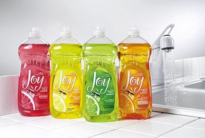
They now expect the same excitement they find in premium brands. Procter & Gamble, noting this trend in dishwashing liquid, enlisted the Cincinnati office of Interbrand, a brand consultancy, to review the core equities in its Joy brand and develop a label redesign that adds fun to the dishwashing experience.
The redesigned label features a whimsical typeface reminiscent of twists of citrus rinds, which leverages one of the brand's core equities, a citrus scent. The label also introduces original illustrations of "Droppy," a drop-shaped caricature, that bring citrus slices "to life" on the label.
A paper label from Multi-Color Corp. adorns all sizes of the PET bottle. The labels are flexo-printed in three colors. An extra layer of white near the top of the label, and a varnish coating over both Droppy and the fruit image, enhance the visual impact. Labels on the 25-oz bottles have white screen printing.
Ernesto Levy, P&G marketing director for dish brands, says the redesigned package communicates Joy's attribute of optimism in achieving shiny dishes with a fresh scent. "The package represents all of what Joy stands for. While the new labels are just making it nationally to store shelves, initial customer feedback has been outstanding," he says.