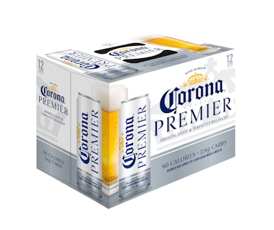
Luxury packaging for food and beverages often signals a decadent product inside, and many times with decadence comes excess calories or carbs. With its package design for a new Corona variant, Corona Premier, Trinity Brand Group turned that proposition on its head, using premium packaging to signal a beer that offers more with less—a better-for-you reward, rather than a guilty pleasure.
The Corona Premier project followed closely on the heels of Trinity’s redesign of Constellation Brand’s 99-calorie Corona Light beer, a lighter alternative to the flagship product, Corona Extra. With Premier, Constellation wanted to create its lightest beer yet—90 calories—with low carbs as well. The beer was to be targeted at men aged 35 to 55 seeking products that fit their active lifestyle while supporting their desire to make healthier choices.
In mid-2016, Constellation looked to Trinity for a name for the new variant, along with a packaging strategy that would clearly differentiate it from Corona Light.
Through researching the beer category as well as looking at better-for-you-brands outside the category, Trinity identified a shift in the way CPGs were positioning healthy alternatives. “We looked at products like Soy Joy, Pepsi Max, and Nourish,” says Erin Paul, Director of Design Strategy for Trinity. “Those are all brands in the better-for-you space, and they all sound positive. It sounds like you’re getting something great, not a less-than version of something else.
“We didn’t want the product [Premier] to feel like it was just like Extra, but with all the good stuff stripped out. We saw an opportunity to leverage that more emotional benefit of, ‘Hey, this has less calories, and in turn, you’re going to feel like this is a reward.’”
From that insight, the Premier name was conceived, along with package graphics that use the iconic colors and symbols of the Corona master brand, but reimagined to produce a premium badge value.
According to Paul, the design was a “purposeful balance of color.” Corona’s equity colors are blue and yellow, with Extra using blue as the dominant color, and Light leading with yellow. For Premier, Trinity made silver and white the dominant colors, with blue and yellow secondary. “Silver and white are category cues for light and low carb when you look across the beer aisle,” says Paul. “So this balance between the Corona equities and the silver and white really helped consumers looking for a light offering quickly see it on shelves.”
The typography for Premier is elegant, in an upper-case serif font, with the lockup between Corona and Premier giving the Premier sub-brand a powerful presence and elevated impression. Brand icons, such as the Corona crown and griffins, are smaller than for Extra and Light, which Paul says makes them “a little more precious and special feeling.” Subtle design elements, such as a line of silver dots between the Corona logo and the Premier name that echo the holes in the crown, were added to connect with premium and luxury brands.
Also maintained is the “horizon line,” a key equity of the master brand, which splits the top and bottom half of the label. A round medallion also found on Extra and Light is used for Premier to house the functional benefits of the beer, “Smooth & Perfectly Balanced.”
Corona Premier glass bottles are printed with metallic silver ink using the ACL (Applied Ceramic Label) process. “The bottle looks beautiful,” says Paul. “When it hits the light, it shimmers and shines.” For the slim cans—a format also used for Light—a translucent ink is used that lets the silver of the aluminum show through, with two hits of white that prevent the surface from looking “dirty.” And for the 24-pack cartons, a gradient technique is used that simulates a metallic ink without the use of one. According to Paul, when viewed through a store cooler, a metallic silver ink printed on paperboard looks grey, unless it’s hit with light, “which never really happens in a cooler,” she adds.
“Overall, this design has an elegance to it that is a step away from the Corona master brand,” says Paul. “And again, it’s not something less than something else. It says you are getting a more sophisticated light beer without compromise. It’s a win/win.”
Corona Premier launched regionally in spring 2017 and nationally in March 2018.
