Selling over 2 million bottles a year across 27 countries, Estonian liqueur brand Vana Tallinn has been growing in popularity in export markets, increasingly competing with international brands. However, its outdated packaging was starting to hold back its expansion plans. Therefore, revamping the brand without losing its essence became essential. Parent company Liviko Group looked to branding and packaging design agency Appartement 103 to redesign the packaging for the heritage brand.
In the first phase, Appartement 103 and Vana Tallinn’s team dug deep into the brand’s history. Says Appartement 103 Creative Director Julien Zylbermann, “Sharing their passion and vision to enhance the desirability of their brand, our client truly opened their doors to us, sharing their deep understanding of Vana Tallinn’s world and its heritage—an inspiring phase that has allowed us to stretch the brand and explore its limits in order to finally unlock its true potential.”
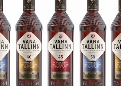
The label is divided into two segments. At the top is a lozenge-shaped label that refers to the defence walls of the old Estonian city of Tallinn, adding strength and boldness to the presentation while highlighting its storytelling. The colors were stripped down to enhance visibility and brand recognition on shelf, while the numbers identifying the different liqueur varieties—40, 45, and 50—have been enlarged to increase differentiation by acting as sub-names.
Furthermore, the Vana Tallinn typeface was refined to convey a more modern and confident stature, while the icon was cleaned up and placed above “Vana Tallinn” as part of the logo.
The bottom part of the label highlights the heritage, quality, and craftsmanship of the product through a carefully selected metallized paper, showcasing the city of Tallinn where the liqueur is still produced using the same legendary recipe since its launch.
“We are very happy with the result,” says Liviko Group Marketing Manager Anna-kai Tors. “Looking at the new design and first market feedback, we feel it is spot-on for Vana Tallinn. Appartement 103’s team was professional, friendly, quick, and guiding, with a good hands-on approach and good portfolio with plenty of experience.”