Since Farmhand Organics of Westminster, CO, began selling jars of its home-batch goods at farmers’ markets in 2009, its focus has been on transparency—specifically its products’ simple, organic ingredients and the farms from which those ingredients come. The company sources its produce, used for its 20 varieties of pickled and fermented products now sold at retail, from 15 organic family farms across the U.S. A testament to Farmhand Organics’ mission of transparency, each 16-oz glass jar of product is labeled with a traceability sticker that gives the name and location of the farm where the produce is grown.
In 2017, the company, then MM Local, underwent a rebranding that included a change in its name and new packaging graphics. Says the company, the new name is intended to eliminate confusion for consumers and align with its core value of farm-to-fork quality and transparency.
To redesign the graphics for its glass jars, Farmhand Organics worked with an independent art director, Noah Clark. Says Co-Founder and CEO Jim Mills, “We wanted to clearly communicate the unique aspects of our brand—producing the highest quality, small-batch products, certified organic, and helping organic family farms in the U.S. grow.”
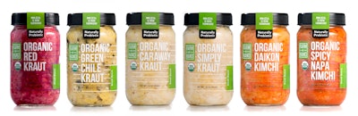
Farmhand Organics’ products include a probiotic line of sauerkrauts and kimchis, as well as pickled vegetables, apple and pear sauces, and fruit spreads—all of which, with their vibrant, and natural colors, lend themselves perfectly to a clear label.
“We wanted a clean design that was not overly constructed from a design standpoint,” says Mills. “We opted for clear labels to show the quality of the product and a bold product font to quickly communicate to the consumer what the product is when it’s on-shelf.” Horizontal lines across the label were inspired by crop rows. A fork and pitchfork icon from the original label design was incorporated into a brand lockup.
“The logo merges the fork and pitchfork, using the negative space from the fork to create the pitchfork tongs,” says Mills. “This symbolizes the partnerships we have with farms that allow us to make the highest-quality organic products.” The traceability sticker is still added to the top of the jar, with the expiration date and batch number printed on the sticker in-line during packaging.
Farmhand Organics’ new packaging for its probiotic lines hit shelves in November 2017, with the balance of its products launching with the new label in the first part of 2018.