In February 2016, when Victor, NY-based Constellation Brands tapped Trinity Brand Group to help them redesign the graphics for their Corona Light beer brand, the challenges were many. How do you differentiate a light beer from your flagship product, when the flagship is already viewed as being a lighter beer alternative? How do you develop a cohesive packaging design for a master and sub-brand while still giving each their own distinct personality? And, how do you modernize iconic design elements without losing their essence? This was a challenge that had eluded several design firms before Constellation put the project in Trinity’s hands.
Corona Light, a 99-calorie beer, was introduced in 1989. Since then, it had gone through several design iterations. In early 2016, its package graphics closely mirrored its parent brand, Corona Extra. Meanwhile, Constellation was marketing Corona Light as a separate and distinct brand, but the packaging wasn’t supporting this strategy.
“Corona Extra was all about the daytime and the beach, whereas Corona Light was more about the night. It was very high end, it was male/female, it was all those things,” says Constellation Director of Brand Marketing Matt Escalante. “As we were creating that brand identity for Corona Light in our above-the-line advertising communications, the packaging remained more or less a version of the Corona Extra packaging, so it felt like a bit of a disconnect from what we were trying to do with the brand overall.
“We really wanted to sharpen the brand identity, to make it feel like a distinct proposition, but still a part of the Corona master brand. We also wanted to modernize the Corona Light packaging, as it hadn’t aged as well as the Corona Extra packaging. We wanted it to be modern, sexy, and premium, but still retain the Corona heritage and be part of a family with the Corona master brand.”
Escalante adds that Constellation was also looking for a design that would appeal equally to male and female drinkers, as Corona Light has more female drinkers as a percentage of its consumer base than any other beer Constellation has seen in its tracking.
With these goals in mind, Constellation and Trinity rolled up their sleeves to find a distinct yet cohesive new design for Corona Light.
Evaluating sub-brand strategies
When Trinity came on board, the packaging design for Corona Extra and Corona Light comprised the same elements, albeit in different locations, the same architecture, and the same colors. As Erin Paul, Director of Design Strategy for Trinity, explains, “Both used a horizontal line that split the package in half as well as large, simple, flat graphics. The color palette was very similar: white, yellow, and blue. And both had a very centered layout; there was nothing askew. It was very clean, simple, and iconic looking.
“Another similarity was the way the brands were perceived by the consumer. Corona Extra was already considered a light beer. Sometimes consumers didn’t even know the difference between Extra and Light. They didn’t know they were two different brands. They would pick up Light thinking it was Extra, or Extra thinking it was Light. There wasn’t enough separation between the two to create a strong point of difference for Corona Light.”
There were some variances in the designs however: Corona Extra uses blue as the dominant color, with white on the top of the horizon line and blue below, while Light used yellow on the top and white below. The crown icon was also larger on the Light packaging and placed above the Corona logo, while the crown, with a medallion, was placed below the logo on the Extra packaging. “Even though they had the same visual brand equities, they were treated slightly differently,” Paul says.
About a year prior to the Corona Light project, Constellation redesigned the graphics for the Corona Extra can, gathering consumer insights in the process. While not specifically related to Corona Light, this feedback laid the foundation for the new design. One thing they learned in the visual equity study was the difference between Corona Yellow and Corona Gold. “The color was definitely a yellow, not a gold,” says Escalante. “The way consumers thought of it, it was representative of the sun, rather than being this aspirational or unattainable premium related to gold.”
Corona also learned that the color white on the packaging, rather than being a negative of the blue (Extra) or of the yellow (Light), was a distinct part of the brand color. Another discovery: The icons of the griffins—legendary creatures with the body, tail, and back legs of a lion, the head and wings of an eagle, and an eagle’s talons as its front feet—were very important to the brand. “They add an element of heritage and authenticity,” says Paul, “but they needed to have more of a reason for being there, more of a purpose.”
Adding to Constellation’s research, Trinity looked across the beer category as well as outside of the category at brand families and different brand architecture strategies to see which would be a good fit for Corona. They found two approaches at different ends of the spectrum. The first was where Light would be like a “little sister,” or a sub-brand, of Extra. “Almost like Coke and Diet Coke, where there is a similarity of the architecture, but Diet Coke really stands out on its own as a sub-brand,” explains Paul.
The other end of the spectrum was the brother/sister strategy, with one example being Michelob and Michelob Light, where Michelob Light is very similar to Michelob.
The sub-brand strategy was essentially what Constellation was using at that point. Says Matthew Youngblood, Principal and founding partner of Trinity, “The question was whether we could just clean up Corona Light and make it work a little stronger with Extra, or should we push it away? Corona was already pushing it away with their advertising. That helped us lean toward a design solution that gave Corona Light a little more breathing room, while still having all the ‘iconic-ness’ of Corona.”
Paul adds, “We identified a sweet spot between an umbrella brand, where the more coherent solutions are cohesive ones, and the sub-brand strategy. The sweet spot was the balance between coherence and differentiation. It allowed us to leverage the iconic brand equities of Corona, but use them in a way that was really unique to Corona Light, and gave it a distinct feel and look.”
A modern facelift
According to Paul, where previous design firms failed was in taking the “old school” brand equities—the crown and the griffon, for example—and making them feel modern and sexy, while retaining some of the master brand feel.
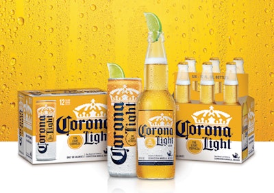
To begin with, Trinity kept the dominant yellow of Light to differentiate it from Extra. To maintain the Corona family look on shelf, Trinity maintained the horizon line, but moved Corona Light copy to the right to create tension and energy. Another change: The “L” in Light was given an additional flourish to place emphasis on the word.
The crown was also retained, but given a modern facelift “to infuse an upbeat personality and fresh modernity to this authentic Mexican brand,” says Paul. The change involved making the crown much larger and tucking it behind the Corona wordmark.
Under the horizon line, Trinity added a yellow medallion that duplicates the one used for Extra and reads, “The Light Cerveza.” Says Paul, “We created a bold lockup with the Corona Light logo to really establish the proposition that this is a light beer. It’s kind of a fun way to position it, as we are using the Spanish word for beer and the English word for Light, but mimicking the copy, ‘La Cerveza Mas Fina’ [the finest beer], used on the medallion for Extra.”
Trinity also gave the griffins “a purpose,” versus just having them float on the package. A single griffin in blue is locked up in the bottom corner with the brewed and bottled import information to support the authentic Made in Mexico credential—“almost like a sign-off, or a signature, if you will,” says Paul.
With the previous packaging design, there was a lack of alignment within the Light brand. The can was silver and blue, and the secondary packaging used a frame rather than a horizon line along with a solid yellow background. “The silver of the can was very disconnected from the yellow and the white used for the rest of the packaging,” explains Escalante.
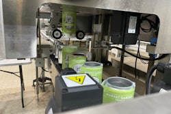
The new can and secondary package use the yellow-and-white palette, along with the horizon line. “Now the can and bottle relate to each other and create a strong family look on shelf,” says Paul. “The can is dynamic and modern, but it still leverages all the Corona equities. The white signals light and feels modern and fresh versus before where the can was silver and blue. It could almost have been an Extra can, it was very confusing.”
Twelve-pack cases now use a picture of the bottle or can on the front of the pack, to flag for consumers what’s inside and make it easy for them to grab the right format. A conscious decision was made to call out the 99-calorie proposition of the brand on the secondary packaging, while leaving it off the primary. Says Paul, research done by Trinity indicated that when consumers are in a bar or social situation, they don’t want to be reminded or advertise to others that they are watching their waistlines.
A design that pops
The new design was introduced in March 2017, meeting all of Constellation’s expectations and goals. “The response from our system distributors, retailers, and consumers has been very, very positive,” says Escalante. “Sales have been phenomenal, particularly for the can. People just love the can, especially compared with the old design. The new design really pops and is a great visual for the brand. And, you can see it from across the room and know it’s a Corona Light can, which was not something we had with our previous incarnation. So, it’s been really well received. We couldn’t be happier with the new design.”