In the world of packaging, customization has become king, with brands using clever strategies to appeal to consumers’ individuality. In summer 2016, Coffeemate rolled out a limited-edition series of label designs exclusively for Target that tapped five key influencers to help bring to life their unique summer experiences on-pack.
To create the Coffeemate Celebrate Summer line, Nestlé enlisted Chase Design Group and brand activation agency Geometry Global. To begin, Chase brainstormed with the Nestlé team to develop themes that captured a range of fun summertime activities, such as urban exploration, music festivals, and farmer’s markets. As Paula Hansanugrum, Creative Director for Chase Design Group explains, five influencers were then chosen to be interviewed by Geometry based on their unique, authentic voices, which corresponded to the themes.
Influencers included outdoor photographer Becca Skinner, professional stand-up paddler and outdoor photographer Slater Trout, artist Matt Crump, women’s lifestyle blog Glitter Guide, and photographer Rose Clayton.
Following the interviews, Chase translated the influencers’ stories into label artwork, with the same theme re-envisioned in two versions—one for Coffemate’s French Vanilla flavor and one for Hazelnut (the two most popular flavors)—for a total of 10 bottle designs.
Says Hansanugrum, “The key considerations we had were brand blocking at shelf through designs that could interconnect, findability for current French Vanilla and Hazelnut flavors, and the role of back-of-pack to add influencer-inspired engagement.”
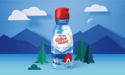
The resulting labels used a clean, modern illustration style that complemented Target’s design-driven environment. To help consumers recognize their favorite flavors, Chase used the same palette of colors as those for the traditional packaging: yellows/oranges for Hazelnut and blues for French Vanilla—colors that also evoked sunny summer days. To create a larger panorama and billboard effect at shelf, the same horizon line was carried over across all the bottles. The back panel featured copy that told the personal story of each influencer, the photography that helped inspire the design of each person’s bottle, the campaign hashtag #moresummer, and the influencer’s twitter handle and signature.
As an example, for the bottle design inspired by Skinner, the theme is off-the-beaten-path adventure. In the French Vanilla version, Chase brought the theme to life as high alpine camping; for Hazelnut, it depicted desert camping. On the back of the bottle, copy by Skinner explores her love of camping, while three photos show a tent, an outdoor scene, and Skinner with her dog.
Labels were gravure-printed in nine colors by American Fuji Seal, which produced 598,000 labels for the limited-edition bottle. The campaign ran for eight weeks, from July through August 2016.