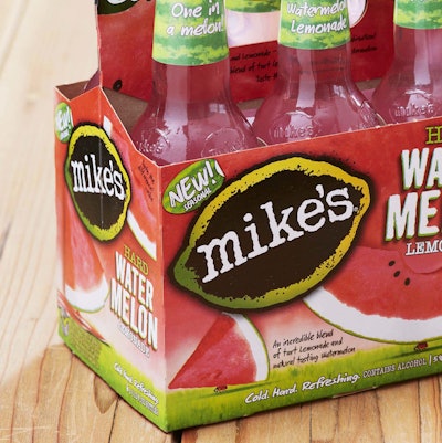
Since the original Mike’s Hard Lemonade was cracked open in 1999, the privately owned beverage manufacturer has continued to offer seasonal flavors to keep its portfolio fresh, with watermelon being the newest flavor.
Mike’s tasked brand design firm Perspective: Branding to create a distinctive look for the new flavor while also visually linking it with the recognizable Mike’s brand lineup.
“Our goal was to help it stand out amongst its competitors by focusing on the uniquely refreshing visual elements of a watermelon,” says Simon Thorneycroft, founder and CEO, Perspective: Branding. “Consumers have their favorite go-to flavors, but look forward in anticipation to new twists introduced throughout the year. They have come to expect great innovation from the brand, and we strive to match that with our designs.”
A watercolor-like illustration depicting large slices of the fruit adorn both the bottle label and the outer paperboard packs to cue the refreshing quality of the beverage.
“The Mike’s brand has a great sense of humor, so we carried that through by depicting a small ladybug walking off with a huge slice of watermelon. I’ve always been fascinated by extreme scale juxtapositions in nature and design: the enormity of a wave to a surfer, or an ant carrying a leaf. I love to bring that into design when I can,” Thorneycroft says.
Green watermelon rind illustrations on the neck label allow it to stand out on the shelf along with the familiar white type on the black signature Mike’s logo and black closures.