The tequila market in the U.S. is a crowded one, with distillers offering varieties to fit every budget, from value brands to well-aged high-end and super-premium products. In August 2014, Constellation Brands of Victor, NY, known for its beer, wine, and spirits portfolio, acquired Mexican import Casa Noble Tequila. To help make its entrance into the tequila market a success and bring the super-premium tequila brand from niche to national recognition, Constellation engaged Trinity Brand Group as its brand strategy and design partner.
According to Trinity Partner, CEO, and co-founder Matthew Youngblood, Constellation had two primary objectives for the redesign. First, the core line of three tequila varieties needed to work harder on shelf; second, the new brand identity had to immediately communicate the super-premium product proposition and unique story that made it a hit with connoisseurs. “Their goal was to quickly scale up distribution and sales to be a national leader in tequila,” he says.
Developing a design strategy for Casa Noble involved an audit of the tequila category, a mapping of the white space category, and an evaluation of Casa Noble’s existing messaging and equities versus its competitors. The resulting brand idea, says Youngblood, “drove the development of a new brand identity, packaging, brand voice, and story that today lives across all consumer and trade communications.”
Existing design challenges
Before being purchased by Constellation, the super-premium, triple-distilled Casa Noble brand was well respected by industry experts, but in its existing packaging, was not working hard enough on shelf to attract new consumers. Among its drawbacks, the brand mark, while elegant and refined, had a feminine look that did not align to tequila category expectations. In addition, the font was seen as being rooted in a formal, “old world” European elegance.
The custom, hand-blown bottle was striking, but rendering two varieties of the tequila in blue and purple resulted in the spirit taking on a greenish hue on shelf. Reflective paper labels paired with a monochromatic, embossed design made the bottles recessive on shelf and hard to shop. Lastly, the purple brand color for the Añejo variety, although ownable within the category, was seen as feminine and not connected to Mexican heritage.
Identifying a unique story
During the research phase of the project, Trinity deployed its Looking Glass Methodology of category immersion to uncover key insights on the tequila marketplace and opportunities for Casa Noble. It looked for cost-of-entry cues that differentiated tequilas from other spirits and found commonalities that existed across all price points as well as certain reasons to believe that every tequila had to deliver.
From this, it identified four main drivers within the category: Regardless of price point or functional attributes, every key brand player was masculine, transformative, confident, and authentic. It also found an opportunity for Casa Noble to define its Mexican heritage beyond just place—all tequila brands share a provenance from Jalisco, Mexico—and connect rather to the “Spirit of Mexico.”
“We identified that an authentic story for a tequila brand was a must, but doing it in a way that was unique and compelling to a U.S. consumer posed a major challenge as the largest players were telling very similar stories around functional reasons to believe,” says Youngblood. “We utilized our proprietary Brand Compass mapping product to collaborate with the Casa Noble brand team to author the strategy, including positioning, behaviors, personality traits, and essence—‘The Noble Pursuit.’”
The Noble Pursuit strategy hinges on the family history of the tequila brand, in particular its “Masetro Tequilero,” Pepe Hermasillo. Hermasillo, who oversees the entire tequila- making process for Casa Noble, represents the seventh generation of tequila makers in his family. “The knowledge and passion passed down for seven generations is a key part of why he is so driven to craft the very best tequila in the world,” says Youngblood.
He adds that The Noble Pursuit brand idea and positioning received the highest consumer scores ever for Constellation in an Ameritest study in the areas of relevance, purchase intent, and differentiation.
Contemporary, vibrant design elements
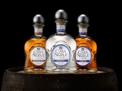
The new design preserves the same package structure: a squat, square 750-mL glass bottle with indented sides, topped by a round pewter closure. “Lower-priced tequilas were found in tall, thin bottles versus the Casa Noble bottle, which is short and shy,” says Youngblood. “From a category perspective, it works successfully to communicate the brand’s super-premium perspective.” However Trinity did recommend using clear glass for all three varieties, using color-coding on the bottles and cartons to designate the three tequila styles.
The new logo includes the Casa Noble Tequila word mark, which pairs bold and sophisticated custom flair-serif letterforms with an elegant, calligraphic script that together telegraph the super-premium nature of the product. The word mark is combined with a medallion icon that Youngblood explains was designed to tell the story of the respect and honor that Casa Noble holds for the land, the agave plant, and the timeless traditions that go into tequila making. The medallion includes an image of a volcano, which nourishes the soil, and an agave plant. Two crossed coas—the sharp, long-handed tools used to harvest the agave and prepare them for their transformation—divide the medallion into four quadrants. The medallion is also embossed on the top of the silver cap.
Other graphic elements include a triple-barrel icon on the secondary and neck label that features Casa Noble’s iconic barrelhouse, another agave plant, and the piña that is the heart of the agave. All of this is supported and authenticated with the signature of Pepe Hermosillo.
“Every element was considered and designed to work together, playing off different aspects of the brand,” says Youngblood. “The bright silver and a bold pop of colors are modern and are juxtaposed with an embossed texture and printed pattern that evokes a traditional adobe wall.”
The new package design launched in March 2016, and reached full distribution in time for May 5, Cinco de Mayo.
Says Youngblood, “While we’re still in the initial launch stage, qualitatively, the initial consumer and retailer response has been overwhelmingly positive. There’s palpable excitement within the Constellation organization and across its customer network. Consumers who know the brand have received the new positioning and packaging with enthusiasm, and in the early days of distribution, new consumers seem to be gravitating to the brand.”