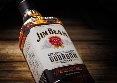
Produced in Clermont, KY, where the Beam family first started production in 1795, Jim Beam has seen dramatic growth in recent years across its largest worldwide markets as well as in emerging bourbon markets. Despite this ongoing positive momentum, the time felt right to update the brand’s packaging to better represent the premium bourbon inside.
In a two-year project, Pearlfisher London brought together its Futures, Strategy and Design Studios to create a new brand architecture and design for the entire Jim Beam Bourbon portfolio. When awarded the project, Pearlfisher’s challenge was to inject the Jim Beam DNA into every product in the portfolio to further establish the brand’s iconic stature across the globe.
Explains Pearlfisher Managing Director Darren Foley, “Bourbon is a hugely exciting and growing category full of independent and characterful expressions. Our opportunity was to assert Jim Beam’s definitive leadership in this dynamic market and make it the global icon of bourbon known and loved by everyone. We created an iconic vision capturing the unique origins, culture, and spirit of the Jim Beam brand, all with the ambition to set the timeless, universal language of the category for years to come.
“The key to our iconic vision was the big idea of family—encapsulating the unique heritage of the Beam family, who are respectfully referred to by many as the first family of bourbon and are thus inextricably linked to the history of bourbon and ‘America’s Native Spirit.’ To promote and celebrate this special spirit, we created a design philosophy called ‘Living Legacy,’ connecting the brand's past to its future and presenting a united family of products that individually and collectively tell a uniquely American story.”
The Living Legacy idea informed the Pearlfisher Design studio’s approach with the creation of a unique Design DNA, a set of six key elements that both unify and differentiate the range across both the 3D and 2D design realization.
Says Natalie Chung, Creative Director, “While establishing a new design language—made up of the Jim Beam logo (the “swing”), the rosette, the bottle profile and footprint, and the new die-cut label—we have given the brand the freedom to express, adapt, and scale the level of premiumization for each product across the different ranges of the portfolio. The new bottle fluting detail is a great example of how we have taken a tactile equity of the brand and used it to express the different personalities of each bottle, from iconic simplicity on the core range bottle to an abstracted depiction of the Rackhouses with more detailed fluting on the core premium and super premium ranges.
“This expression is mirrored in the graphic execution with the ‘swing’ and the rosette, which we have applied in different ways for different products, allowing the graphic treatment of each individual range to have its own personality but always firmly routed in the Jim Beam family DNA. Ultimately, we have ensured that every aspect of design realization, production, and technical competency links back to the original story and the ‘Living Legacy’ of the brand.”
Megan Frank, Vice President, Global Marketing for Jim Beam, says, “Pearlfisher has successfully realized our vision for our flagship brand, giving us a brand architecture and design that effectively communicates and elevates every aspect of Jim Beam’s unique heritage and premium status. We are excited to release this upgraded packaging and to help foster the brand’s incredible momentum for decades to come.”
The upgraded Jim Beam packaging is launching globally—in more than 100 markets— in the U.K. and Germany in April 2016, and in all other markets, including the U.S., Australia, and Japan, in late summer 2016.