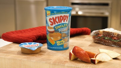
With its new Skippy Singles and Skippy P.B. Bites, launched in mid-2014 and mid-2015, respectively, Hormel Foods has extended its peanut butter brand “outside the jar,” capitalizing on consumers’ desire for single-serve, on-the-go formats and high-protein snacking alternatives. The Singles product in two varieties comprises six 1.5-oz portion cups of peanut butter for dipping packaged in a 9-oz plastic container. Skippy P.B. Bites, in two combinations, are pop-able, round peanut butter snacks served up in a 6-oz clear cup.
From the outset, Hormel envisioned a package that would provide portability and differentiate the product from category competitors while ensuring the Skippy brand personality shone through. Another expectation was that the package would allow consumers to see the product inside—signaling a new Skippy experience. To these ends, Hormel chose Berry Plastics’ Blue Clover Studios to create the package structure and Smith Design for the package graphics.
Through an iterative design process that explored a range of concepts, the Skippy brand team, the Hormel Corporate Package Design group, Berry Plastics, Blue Clover, and Smith Design delivered two new custom packages that meet all of Hormel’s expectations.
Portability plays a big role
The Singles packaging project began in July 2013, when Blue Clover hosted an ideation session with a cross-functional team from Hormel at its design studio in Evansville, IN. Recalls Scott Fisher, Design Director at Blue Clover, “The initial ideation session flushed out many ideas ranging from adaptive to disruptive solutions—from utilizing all or partial existing stock packaging components to very customized concepts delivering on premium counter-worthiness, functionality, and user experience solutions.
“Enhanced styling, functionality, and user experience elements were more noticeable as the ideas traveled up the disruptive channel. However, ease of manufacturing, filling, lead time, and price were also affected in parallel. All of this contributed to choosing the best solution that delivered high on user impact with lower effort to commercialize.”
The resulting secondary package—a clear, cylindrical polypropylene container—is simple and minimalistic, with clean lines conducive to in-mold labeling, which is one of Berry’s core decoration technologies. “Even the small detail of the nesting feature [of the primary portion cups] was thoughtfully designed to preserve a smooth exterior surface, allowing for maximum in-mold label coverage,” says Fisher.
Functionally, Fisher explains, the rigid plastic cup provides structural integrity throughout the life of the product, keeps the portion cups organized, and includes a resealable plastic lid that retains the cups securely. “The size of the cup universally fits a user’s hand nicely and provides easy access and effective dispensing of the portion cups,” he adds.
The cup is injection-molded by Berry Plastics, as is the overcap, made from linear low-density polyethylene plus a color additive to match the Singles variety—Skippy blue for original Creamy, brown for Natural Creamy.
To achieve premium graphics while allowing for product viewing windows, Berry decorates the secondary cup with in-mold labels made of biaxially oriented polypropylene. Inland Label offset-prints the labels in six colors.
Inside the multipack are six stackable Big Dippers DP-150 PP portion cups from Winpak, covered with a foil lidding material printed with the Skippy logo.
The P.B. Bites container is also custom, with a similar cylindrical shape but with a wider diameter and a rounded bottom. While the Singles cup has a clear tamper-band on the outside of the package, the P.B. Bites container features a clear lidding film under the overcap, as the snacks are loose inside the package. Berry Plastics supplies the cup, lid, and IML for P.B. Bites as well.
“Overall the project went smoothly, both in molding and automation,” says Fisher. “The key component to that success was our integration of industrial design and engineering early in the development process.”
Cuing healthy snacking
As for the Singles label graphics, Smith Design retained the most recognizable elements of the Skippy brand, and then combined them with cues for usage, form, and appetite appeal. “Key graphic equities of the Skippy Peanut Butter brand are very simple design elements that have become strongly associated with the brand for decades—making it what we believe is the most recognized peanut butter brand at shelf,” says Smith Design Executive Vice President Martha Seidner. “Bold red logotype on a white background, flanked by vibrant, energetic, teal rays in the background. These graphic elements tell consumers the product is from Skippy; they know and trust it will taste great.”
Prominent on the front of the Singles container is the Skippy logo lockup. Underneath, illustrations of an open cup of the peanut butter accompanied by an apple slice and a celery stick reinforce the idea of dipping and healthy snacking. For the original variety, the dominant background color is teal; for Natural, it is brown. On the right of the logo, a clear area reveals the stacked single-serve cups inside.
“Since the outer container shape is similar to a jar at a fast glance, and sits in the same aisle as jarred peanut butter, it was important to see the little cups inside,” says Seidner.
A side panel to the left of the logo has a separate, vertical clear area that reveals how many cups are left inside, with hints at usage occasions and playful copy—“Lunch, Snack, Any Time!,” “Delightful Dipping!,” and “Time to Get More!”—that aligns with “Skippy’s one-of-a-kind, fun personality,” says Seidner.
For P.B. Bites, Smith Design used a similar strategy, with the Skippy brand equities taking center stage and clear areas on the package showing the bite-size pieces inside. Because the product is more than just a new form of peanut butter, Smith Design added a small picture of a Skippy jar in one corner with the copy, “Made with Real Skippy Peanut Butter.” An illustration under the logo “explains” the product, with the Double Peanut Butter variety showing a peanut and peanut butter, next to a cross-section of a bite. For the Pretzel variety, an image of a pretzel surrounded by creamy peanut butter, along with the cross-section visual are used. Both containers use teal as the dominant color.
More ways to enjoy Skippy
Since being introduced, the two new Skippy products have been well received by both retailers and consumers alike, Seidner says. “The Singles are 100-percent Skippy peanut butter so moms and families love the portability and dipping aspects,” she says. “The Bites are a high-protein snack—much healthier than chips or candy—and both flavors are enrobed with real Skippy peanut butter, so peanut butter lovers are getting their pop-able and portable (protein-packed) fix.”