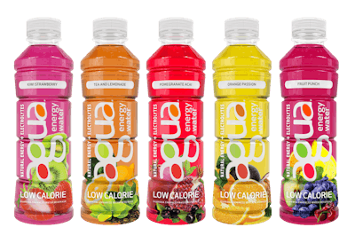
In 2012 beverage industry veterans Dr. Carol Dollard and Michael Venuti saw an opening in the market to create an everyday drink that was hydrating, great-tasting, low-calorie, and energizing, and formulated without artificial flavors, colors, or preservatives. Its resulting Agua Energy Water, in five fruit flavors, provides electrolyte hydration and natural energy from the guarana berry for less than 10 calories per serving. Its newest addition to the brand, the Agua Fruit Essence line, is a hydrating, all-natural flavored water with electrolytes, in six varieties.
While the beverage, and its mission, have remain unchanged since its launch, its packaging has evolved over several iterations to better represent the brand, provide greater shelf impact and “pop,” and improve the visibility of its messaging. “The original package was a stock bottle with a black label around the center that featured ‘natural energy’ as the predominant text,” says Dr. Dollard. “Looking to create our own design that better represented the brand, we evolved the bottle into its current model.”
In February 2014, the company switched from its stock bottle to a custom 20-oz ribbed, slim, hot-fill bottle from Amcor with a clear, full-body shrink-sleeve label that lets the vibrant colors of the fruit-flavored water show through. “The bottle’s modern design provides a comfortable grip that appeals to on-the-go consumers seeking the perfect way to hydrate,” says Dr. Dollard.
Graphics for the new label included the Agua logo, with the original product name “Agua Enerviva” in lowercase letters, positioned horizontally, and the “natural energy hydration” messaging near the bottom of the label. From there, the company undertook a major redesign with an unnamed graphic artist to dramatically improve shelf impact.
“The aim was to create a clean, modern look that was unique to the brand, as well as an eye-catching design that stood out on shelves among competitors,” says Dr. Dollard. “An important consideration was improving the visibility of our logo, and key messaging and benefits on our tall, slim bottle. The final design [introduced in May 2015] leveraged the bottle geometry to achieve the improved visibility and impact.”
The most striking modifications include the change in direction of the logo from a horizontal to a vertical position, the name change from Agua Enerviva to Agua Energy Water, and the addition of vivid fruit imagery that highlights the product’s natural flavors. Also positioned vertically are the product descriptors “Natural Energy + Electrolytes” along with prominent text at the bottom of the label stating that the water is “Low Calorie.” Says Dr. Dollard, “The ‘Low Calorie’ callout is emphasized to help mitigate consumer perception that all fruity beverages are high in calories.”
The label is converted by Hammer, which Dr. Dollard says worked closely with Agua to fine tune the printing process to achieve the high-impact color and shelf presence that the company wanted.
Agua Energy Water is available throughout the Northeast and Mid-Atlantic regions at independent retailers that can be located on at the company’s website.