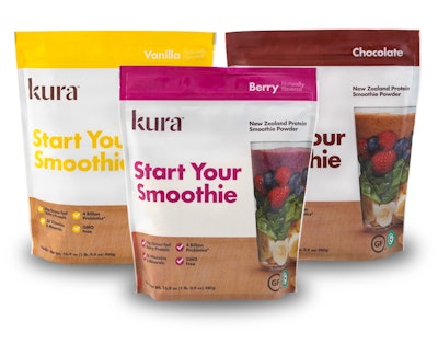
New from Kura Nutrition is a Smoothie Powder that the company says is unlike anything on the market. Each serving provides 14 g of New Zealand dairy protein, vitamins, and minerals that ensure great taste and convenience. With a level of protein traditionally found in the supplement aisle, Kura stands out on shelf in the breakfast aisle as a healthy, wholesome addition to any meal. The Smoothie Powder launched early in 2015 throughout all Sprouts Farmers Market locations, Whole Foods (Southwest), and on Amazon.com.
Designed by Brooklyn-based branding company Red Antler, the packaging is positioned to be clean, modern, and premium, while telling the story of Kura’s New Zealand origins without feeling too rustic. Emphasis was placed on flavor, choosing colors that felt fresh, vibrant, and delicious. This drove the color choice of the logo: an earthy, appetizing dark brown that references the product’s origins but also has the capacity to complement a range of flavor colors.
“Using the Kura display box as a starting point, we saw the opportunity to tell different stories, guiding the customer through the product in a range of ways. From highlighting the products’ New Zealand heritage to telling the story of the process and experience of Kura through photography, the main focal point is the Kura glass on the front of all packaging,” say Simon Endres, Creative Director/Partner of Red Antler.
Notes Kura, the primary typeface is modern and timeless, holds color extremely well, and is arresting on shelf. As the consumer rotates the pack, the Kura Wheel of Construction explains the product in more of an informational format. Shot from above, the suggestion of added ingredients indicates the fun and creative nature of Kura.
On the opposite side, The New Zealand Story uses beautiful landscape photography with grazing cows to speak to the unique and untapped origins of this product. Nutritional information and product benefits occupy the back panel. Finally, the top of the box is embellished with the Kura Seal, reinforcing the product’s origins but also acting as a mark of quality and authority.
As the box is opened, it doubles as a display container, revealing the enclosed 40g sachets. The graphics and scale closely replicate the box face, ensuring a seamless transition.
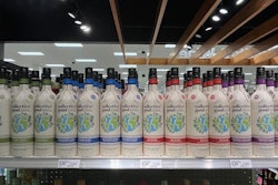
Using the same principles, the design was translated to the 480- and 920-g bags. With more limited space, the story, wheel, and nutritional information were arranged into a grid format on the reverse of the pack, with the front largely unchanged aside from the typographic orientation.