New Tool: ProSource
Checkout our packaging and processing solutions finder, ProSource.

Router pack redesign connects with consumer needs

New graphics for Cisco’s Linksys routers alleviate consumer confusion in an overly complicated category and communicate the powerful potential of the technology.

Front of box
Front of box

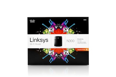
Cisco has redesigned the packaging graphics for its line of six Linksys WiFi routers, with a kaleidoscope of vibrant visual aids and clearly communicated product capabilities, to provide shelf pop and clarity in a category that had become utilitarian and overly confusing.

“Cisco wanted to step up from the category,” explains Kara McCartney, strategy insight director for Landor Associates, which led the redesign. “All of the router providers were following each other when it came to their packaging. If one put something on their box, then everyone else would do the same. Cisco wanted to remove themselves from that battle. They wanted to create something that was intuitive and logical for the consumer, to make it easier for them to choose the correct router for their home or small office.”

From concept to shelf in less than six months to meet holiday sales, the redesign was a “highly iterative” and “fairly intensive” process, explains McCartney, with Landor and Cisco working closely to develop the strategy and organization of the graphic elements on the router box. Cutting through gratuitous information, Landor developed a streamlined capacity chart for the back panel, modeled on the one used on hosiery packaging. “What the chart allows everyone to do is suddenly understand, based on how many devices might be running at the same time, the types of devices in their home, how large their home is, etc., the appropriate router for their needs,” she says.

Another of Cisco’s goals with the redesign, McCartney adds, was to translate through its packaging, “what a wireless router could potentially be in the future, and how it could really become the heart of the home, moving forward.” Communicating this on-pack is a mandala design on the front panel that uses bright splashes of neon color, along with images of compatible devices, such as iPads, laptops, and game controls. “We wanted to use something that would both show the connection of all these devices, but also the movement and the vibrancy that these devices allow you to achieve,” says McCartney.

The eye-catching color schemes also serve the purpose of organizing the routers by capacity, with the Capacity Group A in red, B in pink, C in green, and D in blue. Key differentiating capabilities of each router are also listed in a white banner that runs across the center of the package and also includes a picture of the router, the Linksys logo, the router model name, and whether the device is smart.

McCartney says the new design was launched on schedule in time for Black Friday 2012, to much fanfare: “Almost immediately there were both industry reports and retailers who were over the moon, enthusiastic about the new packaging and what it signaled for the industry.”

How AI is reshaping CPG manufacturing operations
Today’s CPG companies are faced with mounting challenges in their manufacturing operations. You have the data that could help you, but can you turn that data into knowledge? See how artificial intelligence can help. Learn what’s working for Pfizer, Post, and Smithfield.
Read More
How AI is reshaping CPG manufacturing operations
Discover Our Content Hub
Access Packaging World's free educational content library!
Read More
Discover Our Content Hub