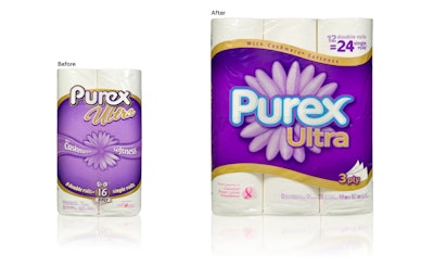
Building on the existing brand equity of Western Canadian bathroom tissue category leader Purex, design agency Shikatani Lacroix has brought the product’s packaging graphics into full bloom, creating a dynamic and contemporary look via some skillful pruning and nurturing. Explains SL senior account director Diane Mullane, the directive given to SL by brand owner Kruger Products L.P. was “to evolve the packaging so it was consistent with Purex’s new and contemporary brand idea,” using existing package elements, including a purple background and a flower graphic. “The creative had to deliver a strong impact to break through the clutter of competitive packages on shelf,” she says.
Among the changes made to the existing graphics on the film wrapper for three varieties of bathroom tissue, the design has been simplified, making key callouts easier to read. “This is important, as consumers make at-shelf buying decisions within seconds,” says Stephen N. Blythe, category director, Bathroom tissue, Kruger. An updated Purex logo is outlined in a bright blue, bringing attention to the brand name, with the logo centralized to command more attention. An enlarged flower graphic positioned behind the logo enhances the brand name as the focal point. In addition, the wordmark and flower are anchored in a wave backdrop outlined by a band of color, “creating a dynamic and contemporary look,” says Mullane.
“Purex’s new look communicates the idea that only Purex brings you pure comfort,” Mullane adds. “The soft flower design, rounded font, and color palette help convey softness and comfort. The strong, bulls-eye graphic element, and the clean and simple design help the Purex brand stand out.”
Package film is a polypropylene six-color flexo-printed by Southern Graphic Systems Intl. (SGS). Varieties include Purex, Purex Ultra, and Purex EnviroCare. Package colors vary depending on variety, with Purex having a purple background and pink band; Purex Ultra, a darker purple with a gold band; and Purex EnviroCare using a purple background and green band.
The new graphics were launched in Spring 2012, and according to Blythe, research has confirmed that the new look is popular with the brand’s target demographic, female consumers. “The majority find the new look differentiated and unique relative to the competitive set,” he says. “They find the design very appealing, which positively influences their purchase intent.”